Our research often takes us away from good Graphic Design in Newcastle. As you’d expect, the web allows us to scour the globe looking at competitors, successful examples and just inspiration in general. This is the next post in our series of global round ups on things that we’ve seen and liked.
Ambigrams are words that are rotationally or reflectively symmetrical. That is, if you rotate the word through 180° or view it in a mirror, it will read the same as it does normally. Most people’s recent exposure to this clever artistic style has been through the amazing designs of John Langdon, whose fantastic ambigrams were used in Dan Brown’s novel ‘Angels and Demons’ (the prequel to ‘The Da Vinci Code’) and its movie adaptation. This led to a resurgence in their use in logos and brand marks. But ambigrams have been in use in branding for decades. Here’s is our list of our favourites, both old and new:
New Man
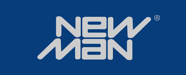
Designed in 1969 by renowned industrial designer Raymond Loewy, this is one of the earliest examples of the modern use of ambigrams in corporate branding. It is rotationally symmetrical and it is testament to its brilliantly simple execution that it is still in use today.
Abba
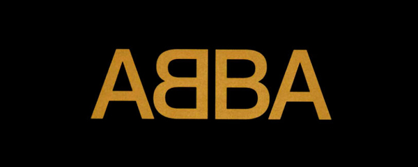
The name of the Swedish megastar pop group (an acronym of the initials of the singers’ first names) is a palindrome which makes the creation of the ambigram here relatively simple, especially compared to the complex words used in some of the other logos. However, for sheer simplicity and recognisability, this logo has to be top of our list.
DMC
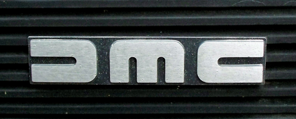
Another ambigram example from the 1970s, the logo for the ill-fated Delorean Motor Company is another instantly recognisable design, at least for those growing up in the 1980s due to its exposure in the classic Back to the Future movie trilogy. Again, simple and timeless.
Sun Microsystems
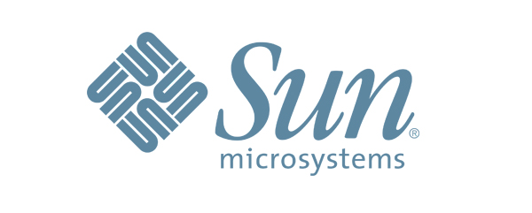
This rotationally symmetrical chain ambigram is often regarded as one of the greatest logos ever designed. Created in 1982 by Stanford University professor Vaughan Pratt, it is readable when rotated through just 90° due to its square lockup. Originally set horizontally and featured on its own on the company’s workstations, it was revised in 1986 to a diagonal position alongside the company name.
Aerosmith
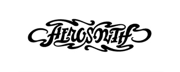
Not actually the official Aerosmith logo, this version was created my master ambigram-ist John Langdon as a gift from Dan Brown to Steve Tyler. As well as being an example of one of the more difficult words to make symmetrical, this is even more stunning as it sticks so closely to the aesthetic quality of their real logo.
Jump
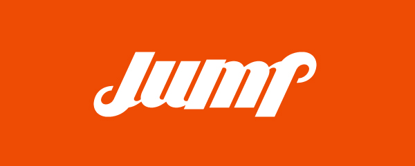
A great logo for the Brazilian advertising agency Jump. Simple and compact it reflects the company’s philosophy of moving ideas.
Bounce
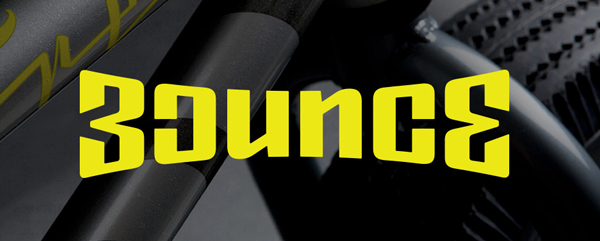
Bounce is an manufacturer and online store for mini BMX bikes and accessories. The logo works particularly well when animated, bouncing around the screen like a crazy stunt bike and, because it is rotationally symmetrical, always landing right way up.
Edge
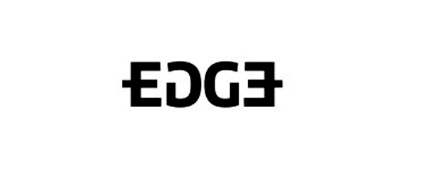
A nice example of a reflective symmetrical ambigram logo for Edge Payment Systems. Like the B in ABBA logo, it benefits from the readability of the letter E when mirrored.