Our research often takes us away from good Graphic Design in Newcastle. As you’d expect, the web allows us to scour the globe looking at competitors, successful examples and just inspiration in general. This is the next post in our series of global round ups on things that we’ve seen and liked.
With the year slowly drawing to a close, ‘best of’ lists are going to abound on the internet and on TV. We thought we’d get in there early with a list of some of the best Christmas-based designs. The parameters are fairly broad encompassing graphic & web design, advertising, illustration and branding. There is individual Christmas creativity as well as large scale seasonal marketing campaigns – all examples of great inspiration taken from the most anticipated holiday of the year.
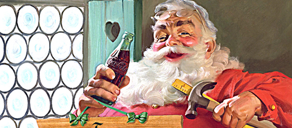
No other item on this list can claim to have formed our visual understanding of Christmas as much as this one. Coca-Cola’s partnership with famed illustrator Haddon Sundblom, starting in the early 1930s and running for almost thirty years, produced some of the most iconic Christmas imagery of the last century. Contrary to popular belief, Sundblom didn’t invent this version of Santa – nor did he change the big man’s clothing to red in order to fit the brand colour of Coke. But his rendering of Santa solidified an archetypal model in the public consciousness which set a template for almost all future versions of the character. What’s more, the success of the adverts allowed Coke to stake a claim in Christmas and become a bonafide festive favourite – not bad for a soft drink firm that had been struggling to boost sales outside of the Summer season.
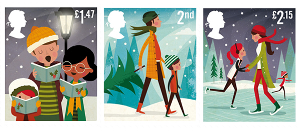
With more and more people exchanging festive greetings by email and social media rather than traditional ‘snail-mail’, the Royal Mail’s seasonal stamps are perhaps not so much a part of Christmas as they once were. However, the 2014 set, art directed by True North and illustrated by American artist Andrew Bannecker, is one of the best in recent years. Featured in a Friday Roundup in November, the designs are so good that they seem a little wasted on the stamps – blown up as large art prints, these would be great framed and set up alongside the Christmas tree and tinsel.
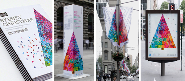
Instead of just relying on some pretty Christmas lights and a big tree in the town centre to get citizens in the spirit, Sydney go a step further each year and develop a festive brand to adorn their advertising spaces. Many cities create Christmas campaigns but they are usually a collection of disparate elements created through local councils, shops, cultural centre points and seasonal markets. Sydney take on the Christmas brand in a cohesive, centralised manner creating a singular promotional voice. This is rolled out in a major campaign covering flags, banners, billboards, posters, print and online advertising, website, promotional collateral and digital applications. This year the branding is built around a colourful geometric Christmas tree illustration with smaller coloured triangles representing the spirit of Christmas spreading around the city. A smart, attractive way of unifying the festive promotions within Sydney’s city centre.
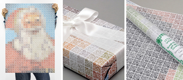
Some years ago QR codes were heralded as the next big thing. Since then, poor implementation and a lack of understanding has lead to an underwhelming adoption of the quick scan technology. This has lead to the codes getting a fairly bad rep. Creative agency The Chase have shown them some love by designing these fantastic wrapping papers using QR codes as mosaic pieces to create bright colourful Christmas images. You can choose from Santa, Rudolph or a snowman for your paper design. What’s particularly clever is that The Chase have also harnessed the basic purpose of QR’s technology – each of the codes is a link to a Christmas present idea. There is also a code specific to The Chase which invites scanners to follow them on Twitter and enter their Christmas quiz. Used as a poster to brighten an office or living room, or to wrap a present bought using the codes themselves, the QRistmas wrapping paper is a little bit of festive genius.
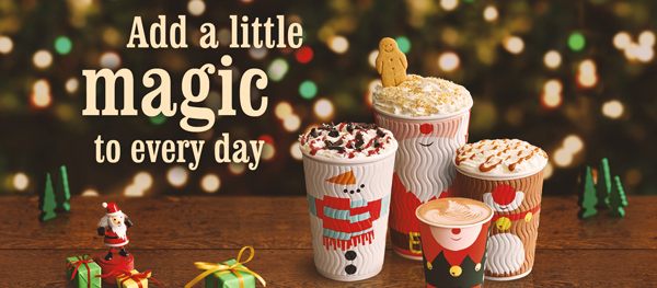
Coffee shops make a big thing of Christmas, capitalising on the season with their warming brews just as the cold weather starts to bite. Promotions abound, tempting us with Eggnog Latte (Starbucks), Black Forest Hot Chocolate (Costa) or Roasted Chestnut Coffee (Caffe Nero). To help keep us cheered during the dark mornings and manic shopping sprees, they also go to town on their takeaway cup designs. Waitrose coffee cups (used in their free coffee promotion for MyWaitrose card holders) is typically stylish with a simple green and white illustration of a festive landscape. Starbucks use a strong red colour in contrast to their usual sparse white and green logo, with subtle stylised snowflakes on the sides. But for sheer Christmas fun, this year’s best cup designs go to Costa with their range of Yuletide characters – Santa, snowman, elf and gingerbread man. If the seasonal drinks don’t get you in the mood, their festive cups will.
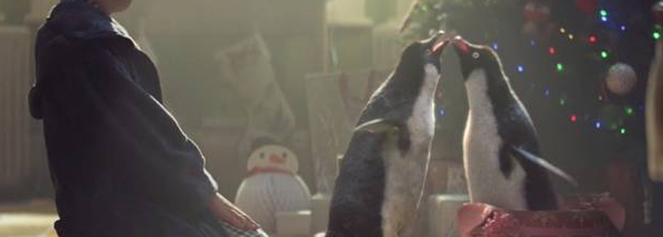
We covered the latest John Lewis Christmas TV commercial in a Friday Roundup last month. Then, as now, we expressed our continuing surprise at how much a part of the festive season these adverts have become in such a short space of time. Their first yuletide commercial aired in 2007 but it wasn’t until 2010 that their marketing took hold in the public consciousness. Now, merely four years later, the adverts are a genuine milestone on the runup to Christmas, as much a marker for the upcoming holiday as advent calendars and freezing cold mornings. It was going to take a huge effort to top the feel-good Disney stylings of 2013’s ‘The Bear and the Hare’ and many don’t believe that this year’s Monty the penguin has managed it. But it has still won out in the battle of the Christmas TV ads and, overall, John Lewis has set an impressively high standard for its festive marketing.
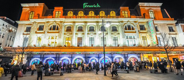
In comparison to the post-iPhone era John Lewis’s commercials, the Christmas window displays at Fenwick department store are a long-standing Tyneside tradition. The first animated window display was unveiled in 1971, after staff from the store were inspired by window designs spotted on a trip to Paris. Forty-four years later and Fenwick still rely on the talents of the same Bavarian company to devise the animated puppets and construct the sets. The whole process takes close to 15 months of planning and logistics – the annual window display being devised in November of the previous year. They are a fantastic Christmas treat – brilliantly designed, lovingly crafted, beautifully constructed and, for Fenwick, a great way to draw in the crowds..
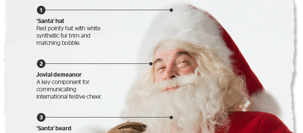
Since Coca-Cola cemented the archetypal Santa in our cultural consciousness (see above), there has been a broad understanding of how the big man should look. But this is often let down in reality by poor beards, substandard fur trim and a lack of portliness. Design agency Glidden set about devising some brand guidelines for Santa representatives everywhere, as well as anyone wanting to use the the Santa ‘device’ in their promotions or marketing. Pay particular attention to the Master Brand Elements (including ‘ample deportment’) and the brand colours – including ‘Simply Red’ and ‘Barry White’.
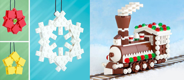
Everybody loves LEGO, even though its cultural expansion seems to have been at saturation point for the past few years. But as the “world’s most popular toy” it seems fitting that it should be utilised in dressing the Christmas tree. Designer Chris McVeigh designs LEGO kit guides which can be downloaded from his website. This year he has added instructions on how to build yuletide decorations from everyone’s favourite plastic building blocks. From gingerbread houses and trains to hanging snowflakes and coloured baubles, the website has everything you need to have a LEGO Christmas. You can even buy special LEGO kits in case your collection isn’t full enough to manage without.
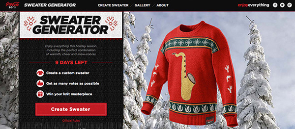
Coke is on here again, this time for a more recent seasonal effort. Capitalising on the baffling rise in popularity of ugly Christmas jumpers, Coke Zero devised a website where users could design their own. It included a gallery of designs, and a polling system whereby visitors could vote for their favourite user-generated design. The top 100 designs were actually produced and sent to the ‘designers’. A great interactive promotion to engage users and get them in the (ugly) Christmas spirit.
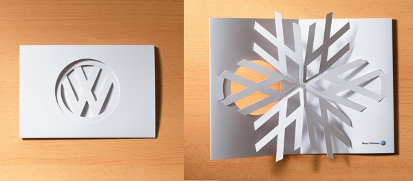
OK – we couldn’t resist adding one Christmas card to the list. There are a raft of designs that we could have included, but we decided on this one for it’s sheer ingenuity. Deceptively simple from the outside with a minimalist VW logo cut from plain white card, it opens up to reveal the V and W are part of an intricately folded snowflake. Pop-up Christmas cards are nothing new (and for the most part not original either) but this one sets itself apart by being so clever and surprising. Furthermore, it’s a great example of the determination of a designer to realise their idea – apparently it took 2 months to perfect the folding technique required.