Our research often takes us away from good Graphic Design in Newcastle. As you’d expect, the web allows us to scour the globe looking at competitors, successful examples and just inspiration in general. This is the next post in our series of global round ups on things that we’ve seen and liked.
Displaying data in a visual form is not a recent development, but with the increasing amount of information that bombards us every day we’ve moved beyond the point of simple pie charts and Venn diagrams. Designers have been forced to devise new and intelligent approaches to conveying information in order to keep our attention. Infographics have become the most popular way to digest often complex data in an easy, attractive and speedy manner.
Infographic topics range broadly from the Chemistry of Champagne to the History of Banned Books; from Outdoor Knots You Need To Know to What Font is your Beard. They are also excellent marketing tools and are at their best when taking interesting subjects and packaging them in an easy-to-grasp design. So, in no particular order, here’s our 11 best (click on the images to see the full graphics):
This deceptively simple graphic is beautifully and very cleverly designed. It takes the huge subject of time – from the birth of the universe to its eventual death – and packets it into identifiable and understandable portions. Each section is integrated into the next and the timeframe builds exponentially. As it admits in its brief introduction, humans are bad at putting time into perspective, but this infographic manages it brilliantly.
At first glance this would seem to fit onto the ‘just for fun’ category. But this one is actually a clever marketing tool for REI, an outdoor clothing and accessories store. The infographic was utilised on the run-up to Halloween and features genuine outdoor survival tips alongside the more tongue-in-cheek hints on how to endure a zombie apocalypse.

7,000 languages in the world? This is a fact-stuffed infographic but nicely breaks up the information into related topics and each topic into neatly boxed tidbits. There’s a lot to learn here and the design makes it easy to take it all in. For every fact you may have heard before, there are two or three that will come as a surprise (Pinocchio is the second most translated book. Really?)
Another fun promotional graphic (this time from online holiday broker latedeals.co.uk). Whilst a little wordier than many other designs, its compensates with a clear, relevant central premise – all the different ways you can circumnavigate the world and how long each would take – and a tongue planted firmly in its cheek. Some travel methods covered include 3-wheel Robin Reliant, Sinclair C5 and magic carpet!
Taking inspiration from mind mapping techniques this workflow guide is a decent visual mentor for those starting out in logo design as well as an entertaining read for any designer who has spent their career in the branding trade. Not likely to actually guarantee you a perfect logo design, it is a useful checking list to make sure you haven’t taken any obvious missteps.

A second graphic from an online holiday company – cheapflights.co.uk – this one eschews the typical vector illustration elements in favour of beautiful inspiring photography of sunrises around the world. For that reason it could be said to succeed as a marketing tool more than the earlier 80 ways design – looking at the breathtaking vistas of Hawaii, Port Vila and Lisbon is enough to make anyone book an impromptu holiday.
Some of the best infographics present a host of numerical data in a manner that can be understood at a glance. This design does just that. There’s no need to trawl through lines of numbers and no need to try and make complex comparisons in your head – we can see immediately who ranks highest and lowest. The straightforward size chart clarifies all the data for us and does so in an appropriately shaped footprint.

This design is about tracking progress and portioning time-relevant information into useful digestible sections. The infographic format is perfect in this case as new parents are arguably bombarded with even more information than the rest of us and are more prone to confusion without clear, straightforward guidance. Plus, it looks pretty so can go on the nursery wall.
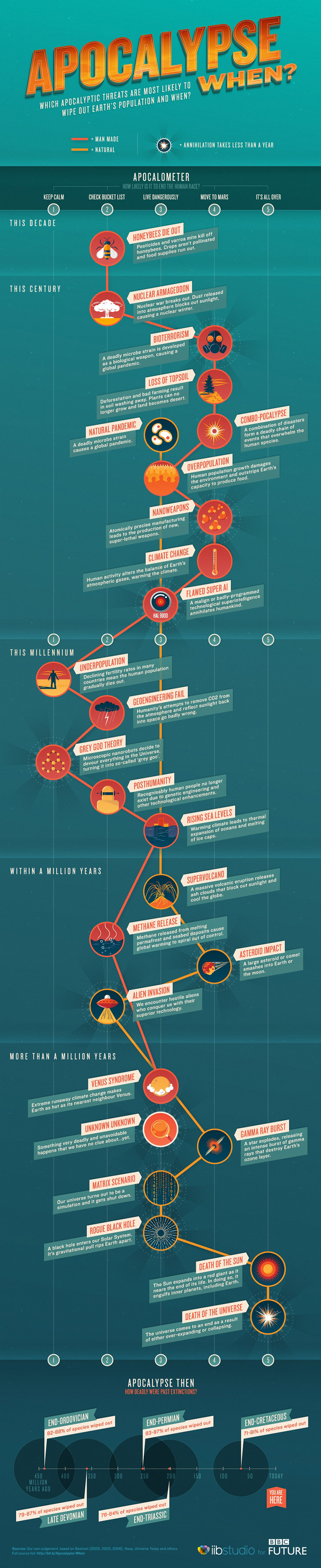
Mixing genuine historic and scientific data with humorous pop culture doomsaying, this graphic for BBC Future brilliantly charts the many possible scenarios that would spell the end of the world. It’s wonderfully designed with a retro 1950s B-movie aesthetic and manages to be simultaneously thought-provoking and funny.
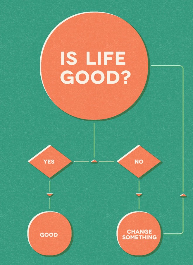
Sometimes it’s worth keeping it simple. Not so much a traditional data visualisation as an infographically-designed motivational poster it manages to cover the most important question anyone can ask themselves in a direct, easy-to-digest fashion – which is what a good infographic does best.
A good one to end on. There are already a number of infographics about infographics but this one stands out through its stylish design and clever implementation of parallax scrolling. It features a huge amount of statistics but because it is laid out over a scrolling mini site it is all a lot more digestible. It is engagingly informative as well as occasionally humorous (the comparison between the road sign and its written counterpart is particularly fun). See the full design here.