Our research often takes us away from good Graphic Design in Newcastle. As you’d expect, the web allows us to scour the globe looking at competitors, successful examples and just inspiration in general. This is the first in a series of global round ups on things that we’ve seen and liked.
The concept of using negative space in Graphic Design is based in the Gestalt principles of visual perception (Gestalt Theory). Which is a fancy way of saying that our minds interpret shapes and the space between them in specific ways.
Our perceptions of negative space are often used in corporate logos and graphic design though not always with great success. It is difficult to keep the use of negative space natural and elegant – too often the impulse to crowbar in an extra element to the logo in this way can leave it looking forced or overly distorted (Golf Spartan) or can even confuse the intended message (Logo Fails).
But creative, intelligent use of negative space in graphic design can have a number of beneficial effects. It can add humour and surprise, reveal an extra aspect or message within a logo or help to build structural elements that would otherwise be impossible. Most importantly, it can create a greater connection with the viewer by making them feel ‘in on the joke’ once the relevance of the negative space has been noted. This list features some of our favourite logos and covers all of those concepts, from the humorous to the serious:

• World Trade Center
Taking on this branding exercise must have been a daunting challenge given the emotional stakes at play. So much was required to be communicated with a single logo. It is on such complex design projects as this that the use of negative space can be so useful as well as important. As a whole the logo forms a stylised W but each of the bars also represents some aspect of the revitalised Center. The negative space between the three top bars represents the two beams of light used in the Tribute of Light held annually on the anniversary of the 9/11 attacks.
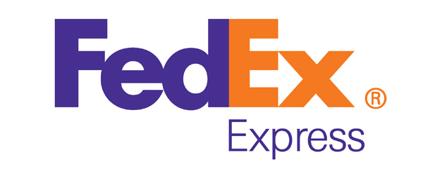
• FedEx
This is arguably the most widely known example of the intelligent use of negative space to ‘hide’ an extra aspect of the logo. The arrow formed from the close kerning of the E and x is an excellent extra graphic element indicating movement and direction, both important factors in FedEx’s business proposition. Lindon Leader, the designer responsible for the wordmark, had to play around with differing fonts in order to achieve the best arrow shaping. Importantly, though, the effect doesn’t look forced, a frequent problem with logos relying on negative space.
———————————————————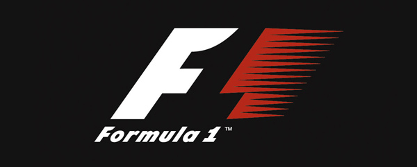
• Formula One
As shown with the FedEx logo, sometimes the proximity of two letterforms is perfect for the creative use of negative space. The F1 logo benefits from a similar happy meeting of two interlocking characters; on this occasion the negative space actually forms one of the characters rather than hiding a subliminal symbol. A similar, if somewhat less effective use of negative space is used in the Le Mans 24 Hour logo.
———————————————————
• Guild of Food Writers
This is one of those logos that seems so obvious once you see it. It is brilliantly simple in its execution, utilising the existing relationship between the shapes of a fountain pen nib to represent the two elements of the guild’s purpose – writing and food. It works so well because the spoon is created through only a minimal amount of manipulation of existing shapes so it feels neither forced nor unnatural.
———————————————————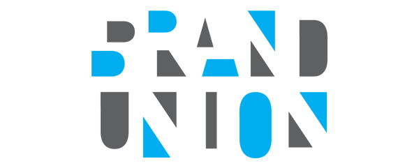
• Brand Union
Our minds force us to see things in the white space between shapes based on the arrangement and relationships of those shapes. The Brand Union logo takes this to extremes by only showing the internal spaces of the characters of their name, intelligently relying on our innate ability to form the letters based on this information alone. They even stretch the idea further by offsetting the shapes forming the B, R and A but we are still able to see the correct letters and construct the words. The company has since rebranded, using a logo that continues to play with these ideas but in a much simpler form: BrandUnion.com.
———————————————————
• Hartford Whalers
Although this logo, designed in 1979 by Peter Good, is for an ice hockey team that stopped playing in the 1990s (the team relocated and changed names to the Carolina Hurricanes), it is still a minor pop culture phenomenon in the USA. That success and enduring popularity is due to its simplicity and elegance as well as its unique approach as a sports logo – no snarling animals or aggressive typefaces here. The beautifully symmetrical lockup features a dominant W and an iconic whale’s tail both working to form the H for Hartford in the space between.
———————————————————
• Harvey Esparcia
This clever use of negative space in a logo is not for a large company or well-known brand. Harvey Esparcia is a Phillipines based designer and this is a personal logo of his initials. The clean simple use of shapes allows us to visualise a three-dimensional image – a great example of how powerful our mind is at resolving recognisable images from simple, disconnected shapes.
———————————————————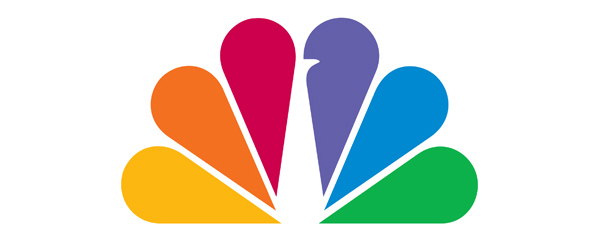
• NBC
One of the most recognisable logos in worldwide broadcasting. the NBC peacock is an excellent example of stylising an animal into a highly useable brand icon. The peacock body and head resolve in the negative space formed from the off-kilter fanning of the simple coloured shapes (with an added notch for the beak).
———————————————————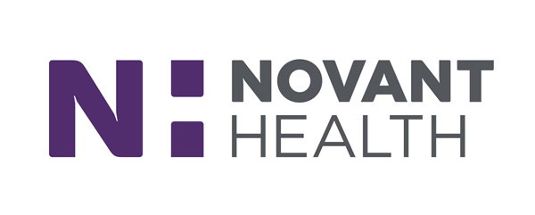
• Novant Health
The logo for Novant Health features a large purple N joined with an H formed in the negative space between the N, the small squares and the wordmark. This logo is somewhat unique in that it relies on the wordmark text to complete the negative space H. When the logo is used without the company name, the H lacks its right-hand structure and the negative space element is removed. In its place the small squares form a purple colon which allows flexible integration with subheadings and taglines.
———————————————————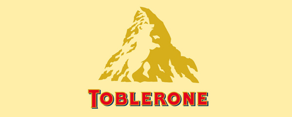
• Toblerone
Negative space is not always used to represent a facet of the company’s service or allude to its products. In the case of Toblerone, the negative space is used as a knowing nod to the company’s heritage. The white out crags of the Matterhorn above the wordmark resolve into a bear, the symbol of the village Bern in which the chocolate originated. Like FedEx, this is one of those logos that creates a talking point, making the viewer feel more connected to it because they have spotted the hidden image.
———————————————————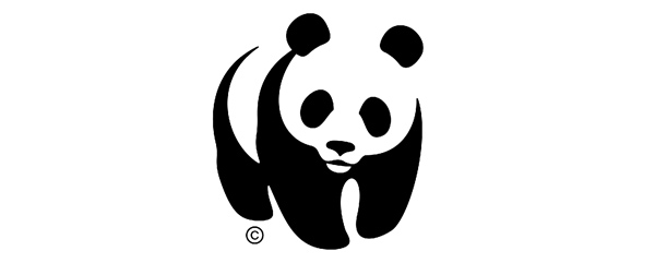
• WWF
This world famous logo cleverly relies on our mind’s ability to recognise patterns and to ‘close’ random shapes into a cohesive whole. Since only the black areas of the panda are rendered, we form the rest of the image using the negative space around the shapes. Because this process is so important in making sense of the image (and because pandas are so recognisable through their colour), the logo is always presented black on a white backdrop and never reversed out!