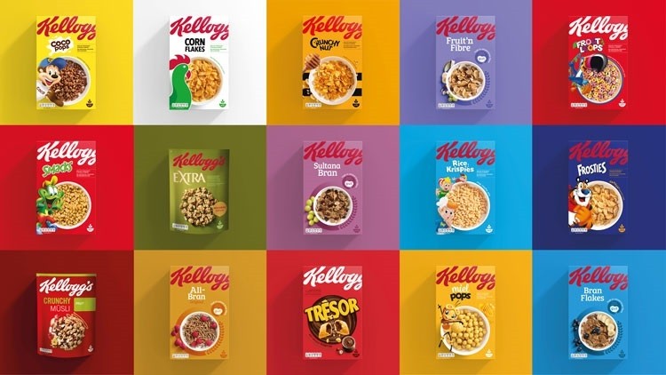
Kellogg’s has rolled out a new packaging design across their iconic range of cereal boxes – the biggest change-up in their 113-year history.
At the heart of the brand’s bold new look is a rising pressure on food retailers to give customers clearer information on fat and sugar content. According to Kellogg’s, the new look also fulfils consumer demands for “more transparency on pack,” with the clearer labelling “improving communication with shoppers.”
“A new visual language has been created so consumers can understand more about the food, and also about the Kellogg’s brand,” officials at the cereal giant said. “The design cues on pack depict the simplification of the food inside the box.”
The brand has also implemented a more transparent language on the revamped packs, cutting back on jargon and taking on a more ‘straightforward’ tone. Design-wise, a larger logo and more striking colours have been used to help the range to stand out on supermarket shelves.
Internal research conducted by Kellogg’s has since shown that nearly 70% of regular shoppers were better able to find the new packs on shelves and purchase intent increase has shot up by almost 50%. If those figures are anything to go by, the future’s looking pretty bright for Kellogg’s.