Developing a successful brand for a new company can often be a delicate process, especially when it involves integrating elements from a different country or culture. Colours and symbols can mean different things to different people and it is essential to approach such a brand project with an open mind and an understanding of the importance of detailed research. This is about more than just avoiding a logo being unpopular (such as Gap or 2012 Olympics); this is about considering the response to a logo or brand from a cultural or social standpoint.
———————————-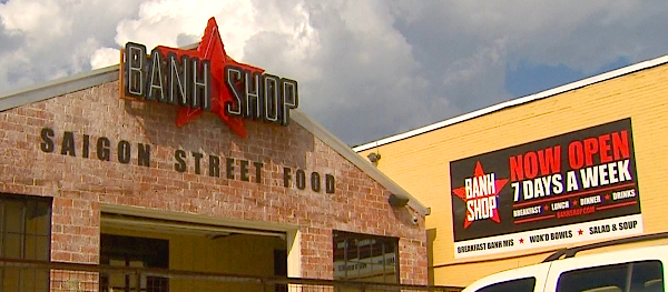
Early last month Yum Brands (which owns Pizza Hut, KFC and Taco Bell) opened a new restaurant in Dallas called Banh Shop. It is a Vietnamese street-food outlet and as such is heavily branded and decorated using Saigon-related styles and imagery. The logo for the restaurant featured the word mark in a bold-condensed font laid over a large red star. Within days, an online petition was set up by Thanh Cung, president of the Vietnamese-American Community of Greater Dallas calling for the restaurant to change its logo. The large Vietnamese community in Dallas – most of whom are political refugees who fled their home country after Communist rule was established in 1975 – took offence at the red star with its heavy Communist overtones.
To their credit, Yum Brands responded quickly to the criticism and almost immediately removed all instances of the star logo from the restaurant, website and company marketing. They issued a written statement of apology to Cung and, following consultation with the Vietnamese-American community, the logo has now been redrafted and relaunched.
This is a perfect example of the effect that a lack of awareness can have when developing brands that are built on, or take inspiration from, other cultures. But there are two broader lessons to be learnt here about brand development. The first is the importance of research. In this case, whatever research was undertaken failed to consider the symbolic overtones of the red star; the links with Communism may appear obvious but it seems the historical implications for the restaurant’s local community where not investigated. However, detailed research is required in any graphic design project, not just those with cultural implications. Researching colour, shape, typography and layout and their associated connotations is all critical in ensuring a successful outcome.
The second lesson is about how to respond to negative feedback. In this case, Yum moved very quickly and removed the offending logo from all touch points, presumably at great expense. They issued an open apology and implemented a process of consultation with the user group who raised the complaint. Any bad feeling generated from the use of the red star logo has been more than offset by their efforts in correcting the situation and the good faith built from positive communication with the Vietnamese-American community.
How a brand responds when things are going well is important, but how it responds when things go wrong is much more significant. The recent Greggs social media blunder is another great example of how to positively deal with a bad situation – most commentators agree that Greggs actually came out of that situation ahead because of the manner in which they responded to it.
———————————-Ultimately, your brand is the way in which you interact with your audience, positively or negatively. We can learn from the Banh Shop how important it is to consider all aspects of the elements used within a brand – logos, colours, symbols – and to research those elements well so that their use will not have unintended consequences. However, your brand is not just what your logo looks like, but also how your company behaves, especially if it makes a mistake. And this has a more direct, longer-lasting effect on your audience.