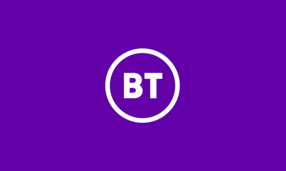
After years of deliberation, BT has revamped its iconic branding with a more stripped-back logo, which now simply features the letters ‘BT’ in sans serif font set in a circle.
But Twitter users have been decidedly underwhelmed by the new look, with many accusing the BT logo of being ‘bland’ with ‘no real meaning’. Others have suggested the new logo takes away any personality that could differentiate the brand in an increasingly competitive market, instead displaying BT as another ‘generic, unemotive brand’. Even Poundland’s social media team have taken the opportunity to poke fun at the new logo, joking that they’d only need to spend a pound to design one that looks just as good. Urgh, that one had to hurt…
But hey, beautiful design is always in the eye of the beholder. According to a BT spokesperson, the motive behind the new simplified corporate logo was largely due to the switch from an offline to an online communications landscape.
“The previous logo was put together for a largely pre-digital world, where most of our brand touchpoints were in print compared to today where 90% of our brand touchpoints are on screen,” they said. “The new design is far better suited to be equally effective in all the mediums we need it to be”.
It’s great to see a major brand like BT embracing change. Change is as imperative for brands as it is challenging, so we have to applaud any brand that takes the leap. But in doing so they must also think about the scale of today’s market and how they can connect meaningfully across it.
The trend of simplicity in the world of design is huge at the moment, with many current brands adopting a stripped-back identity with minimal mess or fuss. But does the storm around BT’s rebrand show that the trend’s gone too far? Is simplicity really key or is there such a thing as ‘not enough’?
That being said, we have to remember that logos are just one aspect of a brand’s wider identity and shouldn’t be looked at in isolation. So we’re definitely intrigued to see more of the design in context as it continues to roll out across more touchpoints this summer. Watch this space…