We always love keeping up to date with what’s happening in the world of design, and this week it was addictive language-learning platform Duolingo’s app redesign that caught our eye.
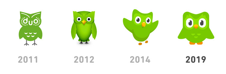
The app’s new look has set out to inject more personality into the brand in a bid to become more ‘gamified’.and motivate users to continue using the platform’s free lessons. Described as Duolingo’s biggest visual shake up in five years, the app now features a brighter look, thousands of new illustrations and an update to Duo, the app’s green owl mascot, who has now been given a wider range of expressions and movement.
“From the outside, it wasn’t entirely obvious that Duolingo needed a redesign – but it was a different story internally,” said Duolingo art director, Gregory Hartman. “We were working with two art styles that didn’t mesh well together, which hindered our ability to use Duo in more dynamic ways.”
Duolingo aims to make learning languages fun and engaging, rewarding users with points for completing learning goals. Duolingo uses gamification to engage its users, using heart bars for correct answers and streak counts for returning to the app every day.
Tyler Murphy, the company’s head of design commented: “Games have this unique ability where you get really attached to their character. That’s why they can keep releasing new games with that same character, and people will rush out to buy them,”
Duolingo’s new design is already available to all iOS users and will soon be rolled out across the Duolingo website.