When Web 2.0 became the next big thing it brought with it a particular online design aesthetic that soon populated the vast majority of new websites – bevels, embosses, reflections and drop shadows (basically most of Photoshop’s layer effects). However, over the last five years or so, this ornamental style has been steadily replaced by the flat design trend. With its roots in established art movements – Swiss Design, Minimalism and Bauhaus – flat UI design is a semi-Modernist revolution against years of skeuomorphism. It aims to strip back logos, icons and layouts to their most basic essentials, rejecting the textures and faux realism of the early 2000s.
It remains to be seen whether flat design is just another short-lived ‘fad’, like skeuomorphism. For now it is still a dominant design style that has taken root in logos and branding as well as online. Below is a list of the biggest companies who have recently rebranded to fall in line with the flat design revolution:
• Social Media
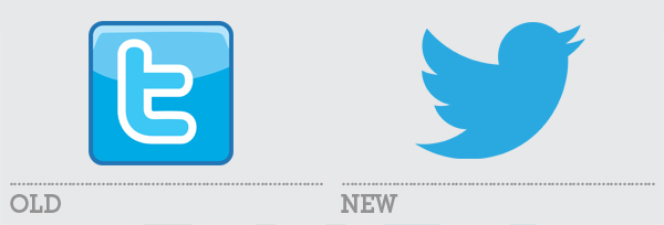
All of the major social media sites have upgraded their logos to a flat symbol. Most prominent is Twitter which switched from a gradient, reflection and thick-stroke iteration of its recognisable ‘t’ to a clean flat rendering of its previously unofficial bird logo. Facebook dropped its hint of a reflection and Pinterest lost it’s multiple drop shadows, but Twitter has made the biggest change and with the best end result.
————————————-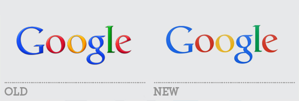
Everyone’s favourite search engine has been gradually dialling down the emboss effect for years but finally made the last final push to full flat this year. The change is minimal between the last version and the current one, but over the years the evolution has been striking.
————————————-• Netflix
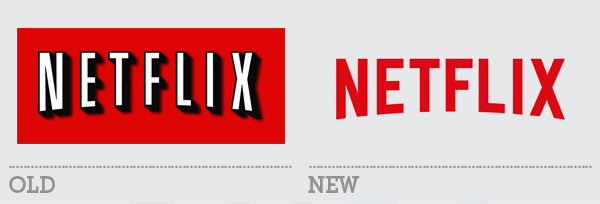
Another 2014 change, the online streaming service rebranded to a flat logo with reworked lettering and a swap around of colour – now red on white rather than white (and black) on red. The old logo had a stroke and shadow that were drawn rather than the result of a Photoshop-style layer effect although the logo did often feature an dark outer glow.
————————————-• About.com

This rebrand was a complete overhaul with new typeface and new layout as well as simplifying to a single colour. The ball graphic was retained in the form of a flat circle that became a containing device rather than a 3D version of the ‘o’.
————————————-• MSN
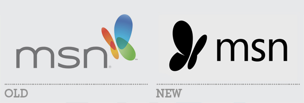
The previous MSN logo didn’t feature any of the more obvious ornamentation of the other logos on this list. It was a fairly flat rendering but did have a raft of gradients that gave the butterfly icon a 3D quality. The new logo swapped out the terrible font and removed the gradients for a much cleaner result.
————————————-• Hersheys
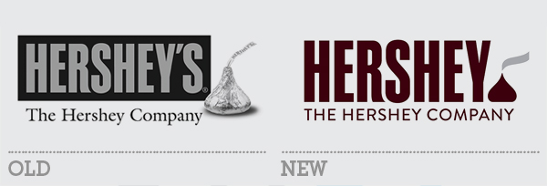
The old design for Hersheys used both an embossed word mark and a photographic element (complete with added shadow). The rebrand flattened out the whole logo and unified the lockup by aligning the elements more appropriately (although the redrawn ‘kiss’ graphic drew a lot of ridicule for its resemblance to a certain emoji).
————————————-• Pizza Hut
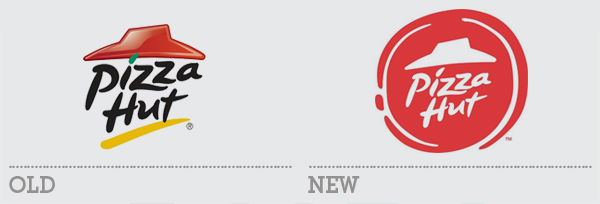
Unveiled just last week, Pizza Hut’s revamped logo is part of a much broader rebrand that includes a hugely expanded menu introducing new recipes, crust flavours, sauces toppings and ‘drizzles’. Their previous logo used flat typography with a coloured ‘i’ dot and underline but its ‘hat’ device was a throwback to early 2000s glossy reflective effects. The new logo takes the partial flatness a big step further, refining the whole logo to a single colour in a stylised pizza frame.