Earlier this month, McDonald’s rolled out a new advert that took minimalism to a new level, replacing their usual product shots with only five words and five colours.
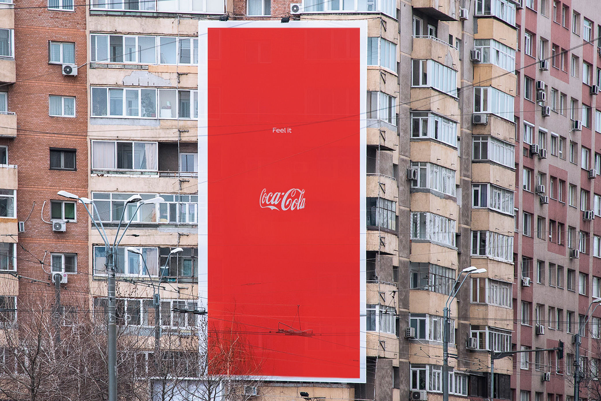
Taking a similar creative direction, Coca Cola have now launched a new minimalistic campaign of their own that simply features 3 things: their logo, their red and white colour palette and a two-word tagline.
Very few products in the world are as iconic as the Coca Cola bottle. So much so that our brains needs very little help to immediately recognise it, apparently. The bold new advert creates the illuasion of a classic Coca Cola bottle by showing the brand’s white logo curving around the distinctive bottle shape and a small title above that simply reads ‘Feel it’.
And we do! The magic of this clever campaign from Publicis Italy is all down to the optical illusion at its core. Through the careful curve of the logo and the perfect bottle-neck dimensions of the tagline, we feel as though we can, somehow, actually see the outline of the non-existent bottle.
While Coca Cola is one of only a handful of global brands that can communicate like this, the campaign certainly shows the impact that minimalism can have and how more brands could learn from the ‘less is more’ mantra.
Coca Cola’s ‘Feel It’ campaign is being rolled out Central and Eastern European markets across out-of-home, print and social.