As a graphic design studio in Newcastle we always take note of what’s happening in the wider design world. Lots can happen in just one short week so here’s a quick roundup of some of the bigger stories we’ve followed from the past seven days:
A company’s ‘brand’ encompasses many aspects, and one of those is their behaviour. Businesses are judged by what they do as much as how their logo looks or their products perform. As such, DHL’s brand has taken a bit of a tumble this week.
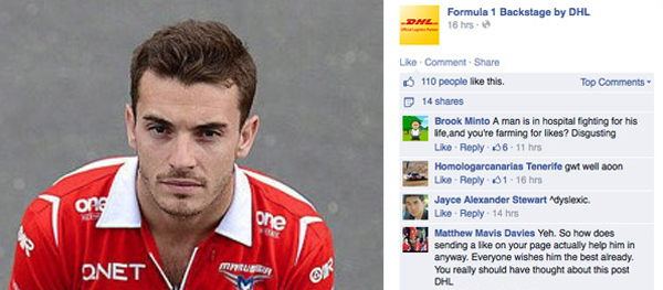
Following the dramatic crash at last weekend’s Japanese Grand Prix involving French driver Jules Bianchi, DHL posted some images of the driver on its Facebook page. These were accompanied by a comment for people to ‘Like’ the image in order to send their best wishes to the injured driver. There was an immediate backlash with many posters decrying the poor taste of this move, viewing it as DHL attempting to capitalise on the racing tragedy for its own social media gain. The comment was removed but, as it goes with such situations, screen grabs began to circulate and Twitter particularly was awash with condemnation.
DHL apologised and tried to explain its intentions – “There was no aim of promoting the site or DHL. This was meant as a gesture of support for Jules Bianchi, and is based on our longstanding involvement in the F1 world.’ Whilst this may have been a genuine attempt on the part of the company to generate online support for Bianchi, it was clearly misjudged and was always going to be open to being misinterpreted. Whatever their intentions, their social media team should have recognised the inherent danger in utilising a tragedy of this sort for any purpose and their failure to do so may have cost the brand dearly.
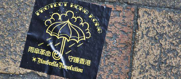
Whenever a movement takes place – cultural, social or political – there is often a symbol taken on board to identify those involved or those who support it. It is interesting, and often surprising, to see which item or concept is appropriated for the purpose; the rainbow of the LGBTQ community, the crossed-over ribbons of AIDS and Breast Cancer awareness, the ‘V for Vendetta’ masks of the Occupy Wall Street movement. Since they were attacked with tear gas and rubber bullets, the pro-Democracy protesters occupying Hong Kong’s financial district have taken the umbrella as their unifying icon, used as it was to defend against the manoeuvres from the riot police.
As the protests continue and show no sign of abating, there is a desire from some quarters to have a standard representation of the umbrella that can be used to further promote the cause – basically, they are looking to brand themselves. A local artist and teacher at Hong Kong PolyU School of Design, Kacey Wong, has launched a competition to gather ideas from artists around the world to find a logo for the ‘Umbrella Revolution’. There have been a mass of entries on her Facebook page – the top three of which will be chosen to individually represent Justice, Democracy and Freedom.
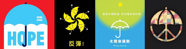
Entries can be posted to Kacey’s Facebook page here.
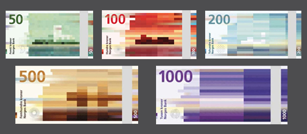
This week, the Norges Bank released images of the new national currency banknotes for Norway to be introduced in 2017. Usually this wouldn’t pick up too much interest – banknotes have a certain uninspiring look about them that tends to involve fine-art-style portraits of famous national figures or landscapes set on a complex backdrop of swirls and grids. These new notes though, designed by the Oslo-based Snøhetta studio, have made an impact due to their simplicity and fantastic originality. Keeping with the traditional subject of landscapes the designs use pixellated illustrations of the country’s coastlines in a range of reduced palettes, overlaid with watermarked waves.
To add an extra dimension to the beautifully rendered mosaics, each design represents a level on the Beaufort wind scale with the higher the denomination, the stronger the wind. The 50 kroner note features a ‘weak’ wind with the mosaic derived from short ‘pixels’ whilst the 1000 kroner note uses long, stretched bars to denote a full gale-force wind. It is a fun idea that results in a set of beautiful designs.
The reverses of the notes, designed by a different studio, are somewhat more traditional featuring nicely rendered illustrations of boats, fish, lighthouse and waves. If anything, these serve to further highlight the originality and creativity of the mosaic designs. Read more about the development of Snøhetta’s The Beauty of Boundaries project here.
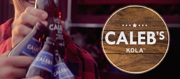
The last few years have seen a steady rise in the popularity of artisan food and drink products, particularly lagers and ales – Brew Dog, Pang Pang Brewery, Four Pure and even Guinness as examples. There is a large consumer demand for such products that market themselves as ‘back to basics’ and hand crafted, using traditional manufacturing methods and reducing their ingredients to the most basic elements. Soft drinks companies are now getting in on the act with Coca Cola having recently launched its Coca-Cola Life brand.
This week, PepsiCo launched their own new soft drink brand that more closely imitates the ideology and branding of craft ales. Caleb’s Kola is named after the creator of the Pepsi formula, Caleb Bradham, and with a ‘k’ rather than a ‘c’ after the kola nut used in the ingredients (and presumably to distinguish it from both Coca-Cola and Pepsi’s own main brand cola). It is aimed at millennial consumers – that is, people in their 20s and 30s – who are interested in authentic, hand-crafted products using simpler ingredients. This is particularly important in the soft drink arena given the change in consumer habits over the last decade or so with many people reducing their consumption of sugar-rich, additive-heavy drinks.
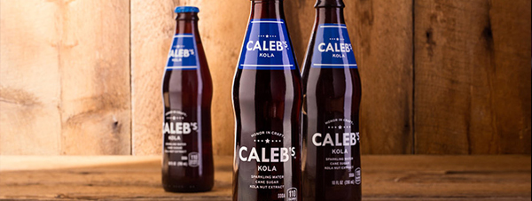
The packaging has an unsurprisingly retro aesthetic but also includes overtones of the craft ale market with its simple white type set against the brown backdrop of the kola. The heavy use of distressed dark wood in the promotional images and website further strengthens this link. Bottling in 10oz glass containers also adds to the air of authentic, traditional drinking. The stripped back, uncluttered designs show a clear intention to distinguish this from other soft drinks and from the company’s other brands and to try and generate a more ‘grown-up’ soft drink customer base, possibly even a new ‘craft soda’ sub-division of the market. But with most people unwilling to stray too far from the soda brands they know and love, and with the inherent obstacles in trying to attract new consumers to (essentially unhealthy) soft drinks, it will be interesting to see how well this new approach from PepsiCo fares.