As a graphic design studio in Newcastle we always take note of what’s happening in the wider design world. Lots can happen in just one short week so here’s a quick roundup of some of the bigger stories we’ve followed from the past seven days.
Use our quick links to read about:
DeviantArt’s New Logo / Harry Potter Book Covers / Obligatory Christmas Item No.3
DeviantArt unveiled a brand new logo this week – one that many of its members would say was long overdue. Launched in 2000, the website was originally conceived as an exchange site for software skins but has quickly grown to be one of the largest creative portfolio showcases on the internet. It is a melting pot of creative input covering a broad range of media and ability levels.
Its logo however, and the website itself, have barely changed since its formative years. Ironically, the website is quite visually unpleasant and can be confusing, especially for visitors stumbling upon the site without knowing how it works. It differs from other similar sites by failing to create an enjoyable user experience even for its members.
Unfortunately, although the rebrand includes the launch of a new mobile app designed using the new brand parameters, the main website remains relatively untouched. The logo has been switched but the colours, fonts and basic layout are still the same as they were, at least for the moment. Which is a real shame since the website is the heart of the DA community and is in desperate need of an overhaul to bring it in line with other portfolio sites like Behance or Dribbble. No doubt that will come in time but it’s still disappointing to see such a well-devised rebrand limited to an identity guidelines microsite.
Book covers are such an important part of the reading experience – they can draw you in or put you off within a few seconds of glancing. JK Rowling’s Harry Potter book series has always benefitted from vibrant, beautifully illustrated cover art – you’d be hard pushed not to want to peek inside.
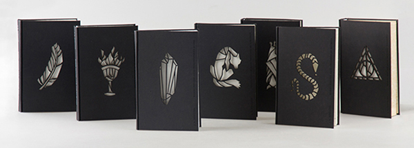
This week, many creative blogs featured these cover redesigns by Hungarian student Kincső Nagy, and with good reason. Although these aren’t official and so won’t be seen on any bookshelves, they are so unique and fun that they make you hope that Rowling spots them and takes them on. Each book features a stark black cover with a cut-out minimalist design representing the story (a stylised crystal for Philosopher’s Stone, a feather for Order of the Phoenix and so on). This is laid over an inner page of luminous paper that glows through the cover’s ‘window’ to give an eerie, magical appearance.
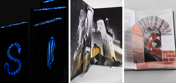
What is most surprising is what’s inside. Nagy utilises hidden cutaways and pop-up pages, normally reserved for younger children’s stories. However, the ink-spatter airbrushed effect, two tone palettes and sharp illustrated angles avoid these interactive elements seeming too much like a childish pop-up book. Instead, they help to build the atmosphere of the story, the stark imagery complementing the young adult content of the novels. All-in-all, this is one of those personal design projects that you wish was real.
Not surprisingly, there was a glut of Christmas related stories to choose from this week. The BBC launched their ‘magical forest’ seasonal indents, the promotional blitz for the Christmas Number 1 got underway and Yule Log 2.0 made a welcome return.
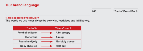
But the Obligatory Christmas Item this week goes to Quietroom for their fantastic *Santa* Brand Book. It is brilliantly funny in its own right but also that little bit sweeter for anyone who has had to trawl through a company’s brand guidelines. The tongue-in-cheek booklet utilises George W Bush-style nonsense words (complexitiveness, constructionalised, legibilitiness) to ape the frequently self-aggrandising terminology found in real guideline documents. It includes such gems as “Santa is an emotion, not a feeling”,”We projected that if Santa was a holiday, it would be Easter” and in reference to the brand palette: “We chose red because it connects to blood, which signifies family, and Communism, which alludes to sharing.”