As a graphic design studio in Newcastle we always take note of what’s happening in the wider design world. Lots can happen in just one short week so here’s a quick roundup of some of the bigger stories we’ve followed from the past seven days.
Use our quick links to read about:
New Ordnance Survey branding / BAFTA film illustrations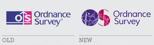
Ordnance Survey is a long-standing British institution. Its roots stretch back as far as the Napoleonic era, when mapping the country was an important aspect in defending our coastlines from invasion. Nowadays, mapping apparently only makes up 5% of the business’s revenue with the bulk of its work currently involving “collecting, storing and sharing location-based information”. And to better communicate their provision of digital and online data, Ordnance Survey have unveiled a revamped logo and visual strategy.
Branded more prominently as OS, the organisation has introduced a new logo involving the two initials boldly rendered as containing devices for maps – one featuring their Southampton-based Head Office and one of a Yorkshire river and fields. The dichotomy represents the urban and rural environments mapped by OS. The colours are slightly reworked versions of their previous brand colours and they have invested strongly in new photographic imagery to adorn the covers of their new maps and marketing collateral.
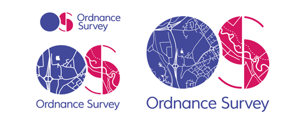
The new OS logo in its 3 versions to be used at different scales.
Since the reveal of the new brand, there has been a significant amount of negative feedback from design blogs. Some of it is technical – the knock-out map elements of the logo may cause problems with ink bleed at smaller sizes and the implementation of three different logos designs for different sizes will cause confusion. Some of it has been aesthetic claiming that the logo is just ugly with inappropriate Art Deco styling (the ‘S’ does have a kinship with ITC Manhattan or Broadway). And as always, there have been the inevitable “looks like it was done by a six-year-old with a crayon” nonsense. Even considering the more legitimate complaints, this new visual identity is a big improvement on the previous logo and should help to make the brand more flexible across OS’s digital applications as well as its ubiquitous paper maps.
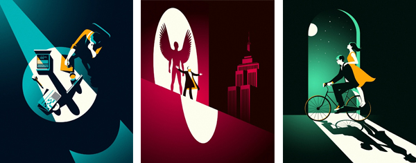
Last weekend saw the glitzy British answer to the OSCARS, the Bafta Film Awards. Now a big player in the global movie awards season, the Academy looked to French illustrator Malika Favre to design the covers of their awards brochures. There were five designs in total, each piece featuring one of the five films in the running for the Best Film award – Birdman, The Theory of Everything, Enigma, Boyhood and The Grand Budapest Hotel.
The artworks are stunning with Favre using bold, clean colours and an intelligent use of gradients to give a retro, old-Hollywood feel to the images. The dramatic use of light and dark, and the hidden imagery in the deep shadows, helps tie the designs to the idea of character duality. The bicycle shadow becomes a wheelchair, and the young boy’s shadow stretches out to become that of a young man. Visit Malika Favre’s website to see the full set.