As a graphic design studio in Newcastle we always take note of what’s happening in the wider design world. Lots can happen in just one short week so here’s a quick roundup of some of the bigger stories we’ve followed from the past seven days.
Use our quick links to read about:
Design Collections / Brand Murray / New Statex Print Calendar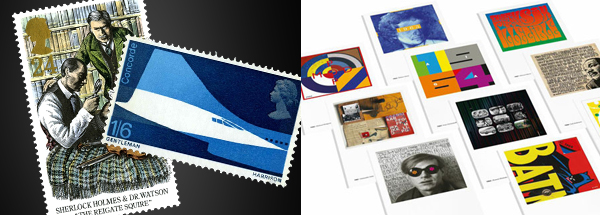
First up, two stories for the price of one. In November of last year, we featured the brilliant festive illustrations by Andrew Bannecker that were used on the Royal Mail Christmas edition stamps. The Royal Mail have been issuing commemorative stamp collections for 50 years now, and in celebration of this anniversary Design Week asked three experts to reveal their favourites. The choices give an insight into the creative breadth and variety of the collections but also into the great skill required to devise artwork appropriate for such small canvases. The styles range from the brilliant, ultra-minimal Concorde design (by David Gentleman in 1969) to the traditional lithographs of the Sherlock Holmes stamps (by Andrew Davidson in 1993). Click here to see the full Design Week article and all the chosen stamp designs.
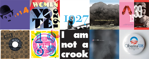
The second design collection story is actually from last year and comes from the American Institute of Graphic Arts who were also celebrating an anniversary. To commemorate their 100th birthday, AIGA commissioned 100 artists to each design a postcard for a single year between 1914 and 2014. With contributions from award-winning designers like Michael Beirut, Milton Glaser and Alexander Isley, the range of work is amazing. What makes it truly interesting is seeing what elements of each individual year the artists have chosen to represent. Some themes are obvious choices, such as the design for 1969 (Moon Landing) or 2001 (9/11); others are more surprising like 2009 (death of Michael Jackson), 1993 (the ‘tragic’ tale of John Wayne Bobbit) or 1956 (the invention of liquid paper). As with the Royal Mail stamps, the variety of styles and layouts is key – every manner and medium of graphic design is covered within the collection. The postcards themselves can be bought from the MOO website.

Modern successful sport stars need to have a brand. With so much revenue coming from sponsorship deals, a recognisable logo is important for sales. Tennis is no exception – Raphael Nadal has an aggressively stylised bull’s head and Federer has his comparatively elegant monogram RF. Unveiled this week and set to be seen on his kit bag and t-shirts at next week’s Australian Open, Andy Murray’s logo seems to be a mashup of both styles. Like Federer he’s opted for his initials and like Nadal he’s gone for aggressive, with its diagonally sliced characters and slightly too italicised forward lean.
Designed by Aesop Agency, it sounds as though the brief was rather restrictive with Murray wanting it to be based on AM but also to include 77 – a number apparently close to his heart (his Wimbledon win broke a 77-year losing streak for British male players and took place on the 7th of July). Including the number was always going to require an angular monogram, and that’s what this is. It lacks the refinement of either of his competitors symbols – it seems a little too tall and the cut angles are a little too oblique. However, I’m sure this won’t stop the mark becoming a recognisable symbol for Murray and likely finding its way onto caps and rackets on the run-up to the Summer.
This week we’re featuring one of our very own creative projects:
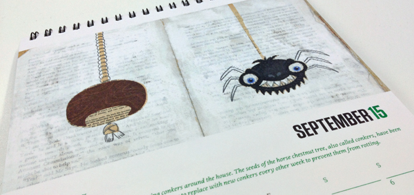
Statex Colour Print are an award-winning print solutions company based in Newcastle upon Tyne. They commissioned Projector to design their new desk calendar for 2015 to be sent out to their clients and supporters.
To show that Statex will always go that extra step to help their clients, each page features a useful hint for that month – a spicy way to lose those Christmas pounds in January; a great pest-repellent use for conkers in September – and is complemented with a set of beautiful illustrations.
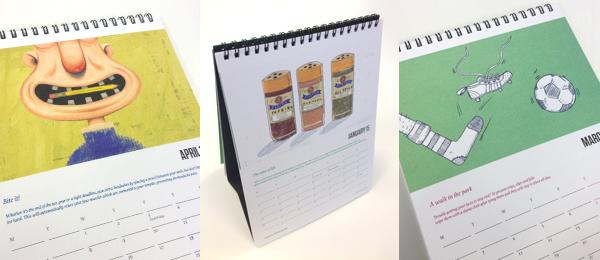
The calendar is printed four colour process as well as using four carefully chosen spot colours to highlight the quality and precision of Statex’s products. The calendar can be ordered through the Statex website.