As a graphic design studio in Newcastle we always take note of what’s happening in the wider design world. Lots can happen in just one short week so here’s a quick roundup of some of the bigger stories we’ve followed from the past seven days.
Use our quick links to read about:
Best of British Design / Spotify’s Redesign / The Chip Shop Awards / Museum of Childhood street art
This week, the results of a poll of 2,000 people conducted by Kingston University produced a top 25 list of greatest British designs. Topping the list is the iconic red telephone box followed by the Routemaster double decker bus and the Union Jack flag. The list is, for the most part, a nostalgic roundup of past glories with only four entries being from the last twenty years – The Angel of the North (1998), the London Eye (2000), the new Wembley Stadium (2007) and the London Olympics Torch (2012).
The list is dominated by two main disciplines: Transport – with the Spitfire, Mini Cooper and Concorde in the top ten; and Fashion, including the miniskirt, Dr Martens and Burberry’s trench coat. It gives an interesting – if somewhat restricted – insight into the public understanding of Britain’s contribution to the design world (the inclusion of the DNA double-helix is a little surprising, being an achievement of discovery rather than design).
Here’s the full list:

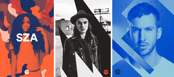
As announced this week at the SXSW convention in Austin, Texas, Spotify is overhauling its brand to reposition itself as an entertainment (rather than a technology) company. Whilst the logo itself – a wifi style roundel alongside the company name in a friendly sans serif font – is staying, Spotify is changing all of its promotional material. The reserved colour scheme of black/dark grey, white and green has been dropped in favour of a brash, bright palette of colours and shapes.
The previous visual identity for Spotify, with its somber user-interface and middle-of-the-road promo materials, lumped the brand firmly in the ‘tech’ camp. Having grown from relatively humble beginnings to become one of the major players in music distribution, the company was looking to express itself in a more lively, exciting fashion to maintain engagement with a millennial consumer base.
The new visuals are a dramatic facelift. The images of the artists are duotone-filtered to give a consistent look and feel, and the vibrant backdrops are of a style you could expect to see from Radio 1 or MTV – clearly repackaging the brand as an entertainment provider. Whether this new aesthetic will make its way onto the app interface, and if so how well it will integrate, is not clear. But as a promotional revamp to change perceptions of the brand, it’s a dramatic and effective step.
The Chip Shop Awards are currently open for submissions. The annual competition looks to reward creativity without limits. Imagine you were given a brief and told you had complete free reign; no restrictions, no liabilities, no comeback. What would you do? And who would you do it for?
The categories range from ‘Best Use of Honesty’ and ‘Best Use of a Celebrity’ to ‘Best Vandalism of an Existing Advert’ and (our favourite) ‘Most Likely to get the Chip Shop Awards up sh*t creek’. Past winners have included the loading icon Guiness advert, the football top Christ the Redeemer and the sarcastic Oxford University promo. A sneak peak at some of this year’s entries can be seen on The Drum website. The closing date for submissions is April 2nd with the winners being announced during a ceremony in June.
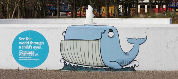
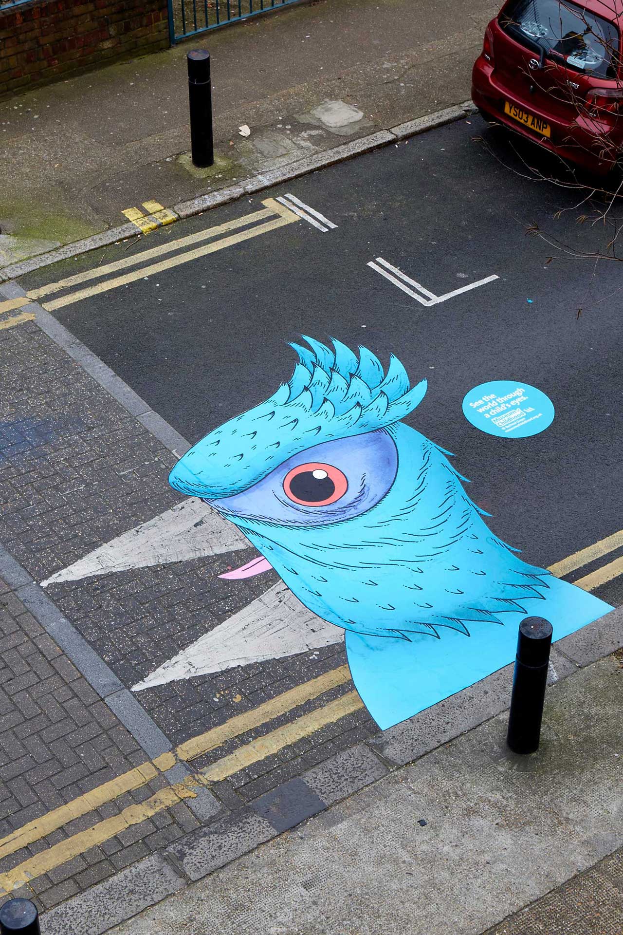
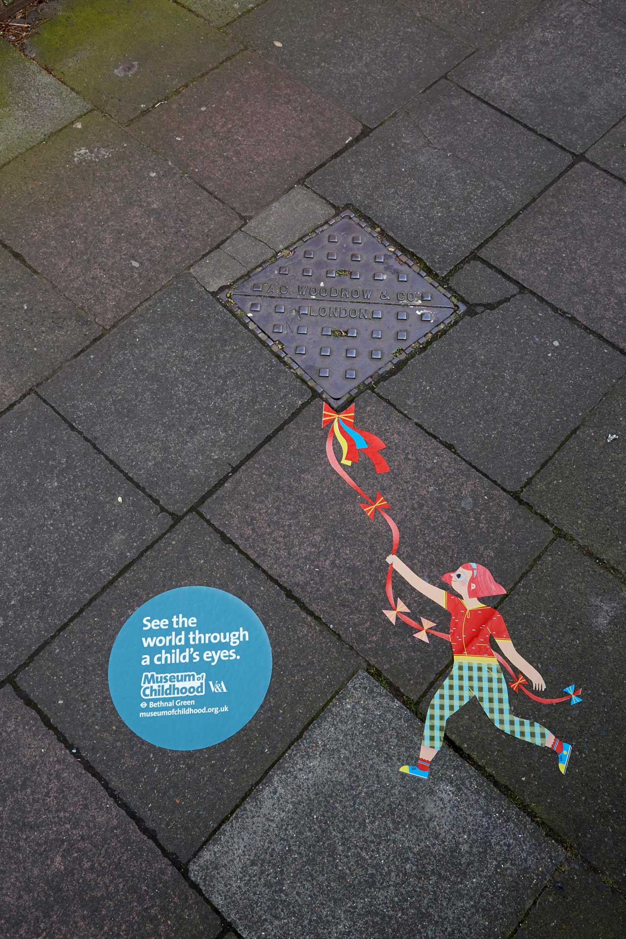
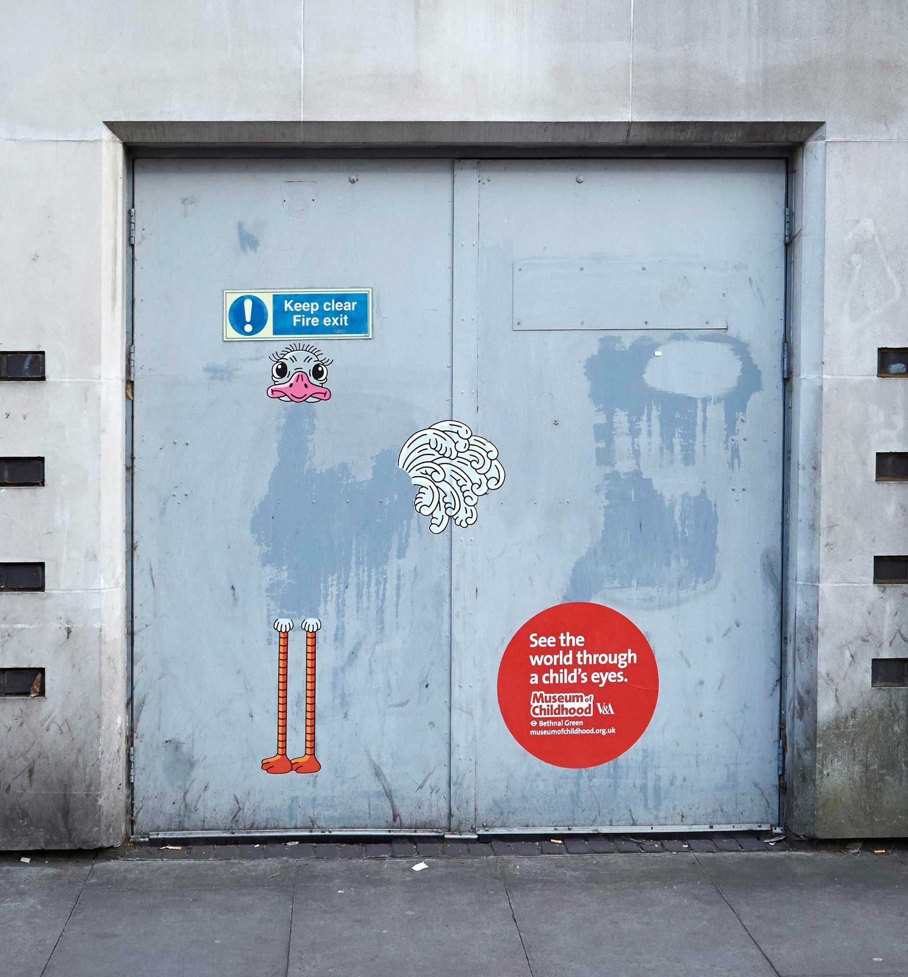
The Museum of Childhood is part of the V&A with a mission to “enable everyone, especially the young, to explore and enjoy the designed world, in particular objects made for and made by children.” Along with its standing collections of toys, clothes and artwork, the museum also hosts temporary exhibitions as well as tours and drop-in activities and events.
As part of a promotional campaign, the museum’s marketing agency, AMV BBDO, hired a number of artists to design a series of large vinyl artworks to be displayed in the streets and on the buildings of the surrounding neighbourhood. The huge colourful vinyls interplay with everyday objects – the painted directional arrows on a road become the beak of a bright blue bird; a square sewer drain cover is changed into a child’s kite; a water stain on a wall transforms into an ostrich. It’s a fantastic premise – eye-catching, funny, engaging – and a great way to promote the mission of the museum: to see the world through a child’s eyes.
 |
 |
 |
|---|
A website has been created – mocseetheworld.com – with more information and a gallery of the artworks.