As a graphic design studio in Newcastle we always take note of what’s happening in the wider design world. Lots can happen in just one short week so here’s a quick roundup of some of the bigger stories we’ve followed from the past seven days.
Use our quick links to read about:
Norway’s new passports / An army of Paddington Bears / Bond and Balls
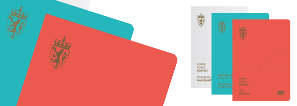
Norway appear to be in the process of altering every touchpoint of their country brand with a view to turning even the most basic and everyday objects into design masterworks. Hot on the heels of the striking redesign of the national banknotes last month, Norway has now approved an amazing revamp of the country’s passports.
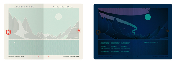
Created by Oslo-based design studio Neue, the new passports are simply and beautifully designed. Most passports have a simple cover – a single colour dominated by a (usually) gold or silver crest. But the unique choice of colours and the minimalist layout of these passports set them apart. The crest is very reduced in size and set to the top left corner, aligned with similarly subtle text in a pleasing sans serif typeface. Inside, the page spreads feature complementary minimalist landscape illustrations in a reduced palette of grey and green. It is simple and effective. The real joy of the design though, is that under UV light, the landscapes are transformed into a night scene with a glowing moon and ribbons of colourful light representing the country’s famous Northern Lights. It is not just a fun conceit, it is also the key strategy in the passport’s security features.
Like the banknotes, the country’s passports are subject to numerous restrictions to keep them in line with anti-forgery guidelines and print production regulations. Which makes it all the more impressive when such well-crafted, beautiful designs are the result. It is a strong reflection on the brand sensibilities of Norway’s government that they approve such striking designs for even something as mundane as travel documents.
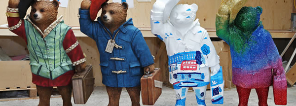
In 1998, artistic director Walter Knapp created a public art exhibition in Zurich featuring a set of fibreglass cow sculptures set about the city. The cow statues were decorated by local artists and at the end of the exhibit were auctioned off for charity. The idea was taken over to Chicago the following year and became known as the Cow Parade. Since then, numerous similar animal parades have appeared all over the world including dolphins, lions, elephants (the elephant parade toured the UK last year and stopped off at the MetroCentre and Eldon Square), gorillas and even Gromits.
The parades are often used to raise both money and awareness of charitable causes. In order to do so more effectively it is now part of the process to get celebrities involved in decorating the statues. The latest such parade is The Paddington Trail which is currently on display in London to promote the launch of the new Paddington Bear film. The famous people daubing the bear statues include Nicole Kidman, Hugh Bonneville (both starring in the film), Benedict Cumberbatch and David Beckham. It is a neat marketing ploy for the film even if the animal parade bandwagon is wearing out a little after 15 years doing the rounds. Once the exhibit closes at the end of December, the statues will be auctioned off in aid of NSPCC, Childline and Action Medical Research.
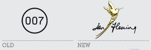
Two rebrands for the price of one this week and from very different places on the design spectrum. First up is the rebrand of Ian Fleming Publications. The previous branding for the estate of the late author was based around his most famous creation and utilised the well-known 007 codename. Which made sense except when dealing with any of Fleming’s non-Bond related publications. This visual identity was also based on plain, sans serif fonts which lacked some of the classic, roguish personality of the author.
Webb&Webb Design were tasked with bringing some of the exuberant and debonair quality of the man himself to the new brand. Relying on Fleming’s signature as the main word mark is a road often travelled, especially in the posthumous branding of a famous individual. But the logo is brought alive by a dominant flourish of a hummingbird – a native to Fleming’s beloved Jamaica and also a cute allusion to the fact that James Bond was named after an author of bird watching guides. The replacement of Didot as the main typeface extends the classic elegance of the new identity and should work much more effectively when applied across Fleming’s full literary legacy.
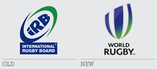
Also announced this week was the rebrand of the International Rugby Board. Capitalising on the coverage of the Rugby Union Autumn Internationals, as well as the growing hype surrounding next year’s England-based World Cup, the IRB revealed their new logo and their new name – World Rugby. The old logo was a bit of a shocker, relying on two mega swooshes to form a rugby ball. This in turn contained an acronym of the organisation wherein the ‘R’ also held a rugby ball. And the fish-eyed letters just looked misshapen.
The new logo fares somewhat better – the sliced off rugby ball forms an interesting ‘W’ for world and the new moniker looks so much smarter than the longwinded old name. I’m still not sold on the colours and think that they could have been updated somewhat which would have helped with the gradient. The thin metallic bevel and reflection effect are unnecessary and detract from the interest built from the logo’s unique shape. On the whole it is an improvement. But it couldn’t really have been any worse than the original and a few over-enthusiatic Photoshop effects get in the way of it being a genuinely solid progression.