As a graphic design studio in Newcastle we always take note of what’s happening in the wider design world. Lots can happen in just one short week so here’s a quick roundup of some of the bigger stories we’ve followed from the past seven days.
Use our quick links to read about:
Children’s Ward makeover / The internet in 2014 / Midwives Rebrand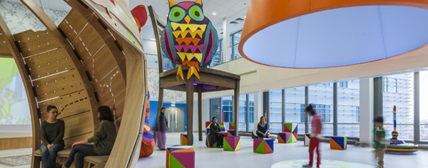
The Royal London Children’s Hospital opened in 2012 and is one of the UK’s largest hospitals for children. Since opening, it has been working with Vital Arts on the building’s interior design and decoration with a view to making the hospital as welcoming as possible for its patients and their families. Painting colourful murals on the walls of children’s wards is standard practice in hospitals but the work undertaken by Vital Arts takes a much broader, deeper and well-considered approach to what is often overlooked as a design issue.

Left images: Morag Myerscough's Delhi-influenced designs / Right images: Tord Boontj's vinyl & perpsex murals
By commissioning professional designers, illustrators and creatives, Vital Arts have transformed the wards and public spaces into vibrant, stimulating, engaging experiences for the hospital’s visitors. The projects have specifically avoided the usual commercial cartoon characters (Disney, CBeebies, Nickelodeon) in favour of unique designs developed by the individual creatives involved. The wall murals by Morag Myerscough involve beautiful, intricate words and patterns inspired by her visit to India. Industrial product designer Tord Boontj’s work on the critical care ward involves vibrant, colourful vinyl murals of animals and nature. These are complemented by raised laser cut creatures in neon and matt perspex adding depth and interest to the walls. A centrepiece of the project, highlighting the original and innovative approach taken by Vital Arts, is the ‘activity space’ created by architects Cottrell and Vermeulen with designs by Myerscough. The space is designed as an oversized living room which massive stuffed animals, a giant chair and huge TV featuring interactive games for the children.
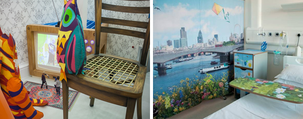
Left: The two people on the rug are not toys, they're full size / Right: Ella Doran's textiles designs for patient cubicles
Other hospitals have taken similar approaches with Chelsea’s Children’s Hospital and Great Ormond Street both commissioning designers to help create more engaging spaces for their patients and families. For more information on the project, visit the Vital Arts website.
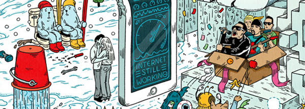
This week, Syzygy unveiled their fifth annual “20 things that happened on the Internet” illustration. Each year the company chooses a different artist to draft up a fun montage of all the ‘important’ events that took place online over the previous year. As the company noted themselves when posting the illustration on their blog, what happens offline and online is no longer separated. Global events, both small and large, take place online and become important aspects of our everyday internet experience. The fun with Syzygy’s montages (this year designed by Andrew Rae) is trying to spot all 20 events included in the illustration. For hints and help on this year’s entry – and to see the entries for the past 4 years – check out the 20 Things website. To see the full size image, click here.
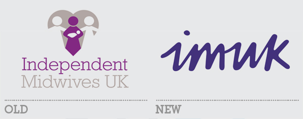
The last decade or so has seen a surge in the popularity of ‘back to basics’ birthing, with an increase in elected homebirths (or birthing at midwife-led centres), a reduction in hospital-centric pregnancies and a wider uptake of independent midwives. This all indicates a growing sea change in the way the millennial generation engages with the process of starting a family. With this in mind, Independent Midwives UK this week revealed an overhauled brand, project-led by Nalla Design.
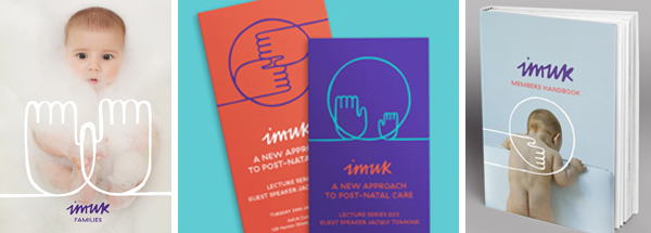
The old logo was rather cliched and clinical and far from the comforting, hands-on feel the organisation was looking to promote. The new brand is bright and welcoming and utilises engaging photography coupled with illustrative hand motifs. It’s an effective strategy and effortlessly conveys the message of support and contact. The logo itself is now an acronym of the organisation name. The word mark is nicely executed if somewhat non-specific – it could be for a toy range or a Scandanavian food company. The primary typeface is also rather cold and stark for such a heartwarming approach although it does contrast with the hand-drawn elements and secondary handwritten font. On the whole the rebrand succeeds in aligning the visual identity of the organisation with its core ethos of continuous family support, and should help them to capitalise on the growing desire for more collaborative healthcare.