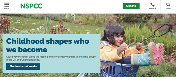
Any good brand consultancy will tell you that rebranding is a big deal and shouldn’t be approached lightly. Your brand is the manner in which you interact with your audience and there needs to be a genuine motivational purpose in changing that interaction. NSPCC revealed their new logo and marketing strategy this month along with the motivations behind it, providing a great example of a rebrand undertaken for all the right reasons.
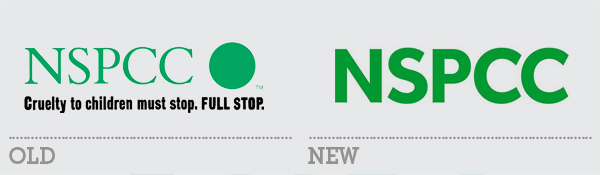
Their previous brand focused on their Full Stop campaign which was launched in 1999 and ended in 2008 (although the slogan continued to be used until this year). The aim, and success of that campaign was to heighten awareness of the problem of child abuse and raise it on everyone’s agenda. Having accomplished that, the charity felt it was time to readdress their brand message and move the conversation forwards.
“[Full Stop] was developed more than a decade ago, and the landscape has changed. We’ve raised awareness of child abuse, but our research shows that people are less clear about the work we’re doing to prevent it. We need to address that to drive up support.”
The Full Stop campaign was necessarily hard hitting and often shocking. It was meant as a wake up call and it succeeded in that aim. As a result, child abuse is much more widely discussed and reported, particularly in the media. NSPCC is now looking to educate the audience they reached with Full Stop about the way the charity works to help prevent child abuse. The new brand is a real shift away from the dark imagery and alarming messages of Full Stop. It is more open, more relatable and therefore allows for a broader audience reach. Importantly, it also allows the NSPCC brand to align itself with other companies and events that it couldn’t do previously due to the darker nature of its campaign. This rebrand tells a great story about an organisation that understands how its brand impacts with its audience and why it is sometimes vital to reinvigorate that brand to better communicate your message.
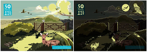
This year, the National Trust launched a campaign aimed at children called “50 things to do before you’re 11¾” encouraging youngsters to venture out into the great outdoors and get exploring. The activities involved include climbing a tree, building a den, picking fruit, skimming stones and hunting for bugs. Number 40 on the list is ‘Go on a nature walk at night’. To accompany this activity, and with the dark nights drawing in, the National Trust enlisted the Lida Agency to design a direct mail pack that could be sent out to existing members, further encouraging them to get their walking boots on.
The pack includes a postcard that uses glow-in-the-dark ink to reveal hidden elements when viewed with the lights out. The main image on the card is a beautifully designed country scene in a style reminiscent of Enid Blyton 1950s-era illustration. It shows bright sunshine, ducks in flight, ladybirds and a deer resting in the grass. To highlight all the other fascinating wildlife that comes out at night, the glow-in-the-dark printed elements include a fox, an owl and a few bats flying by the moon. It is a great idea, even more so to post them out before the half term holidays to get children interested in exploring the nightime countryside and discovering its hidden wonders.
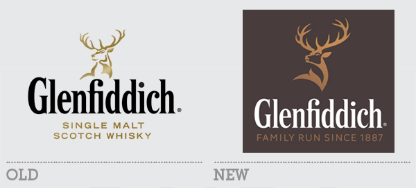
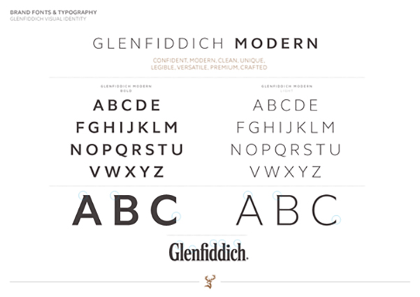
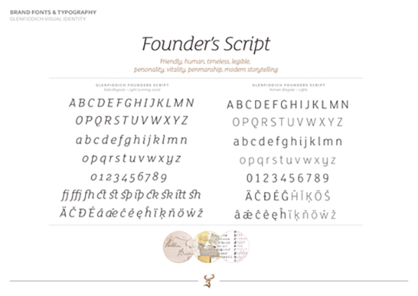
It is fascinating when a rebrand project involves refining rather than overhauling. What elements do you keep and what do you change? It is sometimes easier to start from scratch than it is to evolve an existing design, especially one that has a decent amount of equity bound up in it. The 127-year-old Glenfiddich brewery has a great deal of heritage and a widely recognised stag as part of its logo. This week an updated logo and associated brand language was unveiled for the popular whisky.
The logo update has focused on the stag, leaving the main word mark untouched. The stag first appeared on Glenfiddich bottles in 1968 and was last revised as part of the main logo in 2007. The old version was a little strangely resolved in places, particularly the antlers which looked wobbly and slightly melted. The new symbol is much clearer and stronger with single stroke lines and a sense of dynamic dignity. It is intriguing to note the reason for a particular change in the antlers. The creative director for the project, Gary Westlake said: “Based on his antler points, the (old logo) stag is 8 years old, a young male within a herd. We wanted to turn him back into a royal stag – a majestic 12 pointer, which denotes the alpha male, masculinity, power, confidence and maturity.”
Further to the stag update, the brand has two bespoke typefaces, a sans serif for headlines and a script font for body text based on the handwriting style of the distillery’s founder, William Grant. There is also a new colour scheme of copper, white and dark stone (inspired by the copper whisky stills and granite used on the original distillery warehouses). These have been used to unify the brand which was suffering somewhat from the expanding range of products each with its own colour scheme. The new branding has already made its way onto the Glenfiddich website but it will be interesting to see how it is rolled out to the bottles and packaging. All in all though, it is a great improvement, upping the sophistication and style of an already well regarded brand.