As a graphic design studio in Newcastle we always take note of what’s happening in the wider design world. Lots can happen in just one short week so here’s a quick roundup of some of the bigger stories we’ve followed from the past seven days.
Use our quick links to read about:
Starbucks ends #RaceTogether / Brand Relationships / Go Set A Watchman cover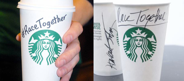
It’s unlikely this could really have ended any other way. The controversial #RaceTogether campaign launched by Starbucks last week has been ‘completed’. It follows a week of unbridled criticism and ridicule, both online and in the press. CEO Howard Schultz maintains that the scheme hasn’t been cut short by the negative reaction but was always going to end on 22nd March.
The idea behind the campaign – to have baristas write #RaceTogether on takeaway drinks cups in order to stimulate conversation about racial issues in the US – was immediately mauled by social media and attracted broadly unfavourable commentaries in worldwide press. Although Schultz’s motivation can be seen as admirable, most saw the move as wildly naive and in many cases, inappropriate. Many people were irked simply by the idea of a global coffee brand attempting to weigh in on such a sensitive issue. Some also pointed out the hypocrisy of such a stance from a company where 16 out of their 19 executives are white and that only pays $7.62 hourly wage to its employee base, of which 40% are classed as from ethnic minority groups.
Despite the skepticism and criticism, and despite Schultz declaring the coffee cup writing campaign complete, this is apparently just the first phase of Starbucks continuing efforts to create discourse about race relations. Schultz intends to leverage the Starbucks brand to create a much broader and longer term conversation including opening new stores in urban communities, hiring 10,000 ‘opportunity youth’ employees over the next three years and expanding its full-page newspaper advertising.
Many global brands have committed their names to the Product Red movement to combat AIDS, which is a great example of how a company can proactively use their public identity to address humanitarian issues. But the Starbucks’ RaceTogether campaign feels forced and awkward and, however well-intentioned, unlikely to positively affect either the company or the cause.
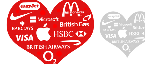
New research by Hey Human has revealed a different perspective on the way in which consumers interact with brands. The concept looks at likening our relationships with brands to our real life relationships and indicates that modern consumer engagement is more akin to Tinder than Mills and Boon. Most brands would like to believe that they cultivate loyalty and fidelity from their customers, but the research reveals a wide range of different relationship levels, from ‘committed partnerships’ to ‘marriages of convenience’.
There is a humorous element to this but also an intuitive understanding of the outcomes. For instance, 60% of those surveyed said they had a ‘secret fling’ with McDonalds and most said that British Airways was a ‘distant lover’ (loved but not bought). Apple elicited genuine brand love with many viewing the brand as a ‘best friend’. And, perhaps unsurprisingly, most described financial services firms and mobile phone operators as either ‘enslavements’ or ‘marriages of convenience’.
The research gives an interesting insight into the reality of brand loyalty. Most mobile operators would believe that they engender fidelity from their customers and that that equates to brand love. But the research reveals consumer mistrust and resentment despite their long term interaction. The thrust behind the research is that the pursuit of brand love is too simplistic and that companies need to understand the relationship with their consumer base better than just in black and white terms. Hey Human identified 14 different relationship types in its study. Better understanding which type of relationship a brand has with its consumers could be the first step to either maintaining that interaction, or changing it for the better.
When it was announced at the beginning of February that a sequel to Harper Lee’s classic novel ‘To Kill A Mockingbird’ would be released later this year there were equal amounts of excitement and skepticism. Mockingbird is the only novel that Lee has had published and she has stated throughout her life that she would not release another book. Despite the criticisms of her being railroaded or manipulated into releasing the sequel, ‘Go Set A Watchman’, the book is still eagerly anticipated and the publisher, William Heinemann is capitalising on that.
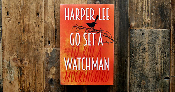
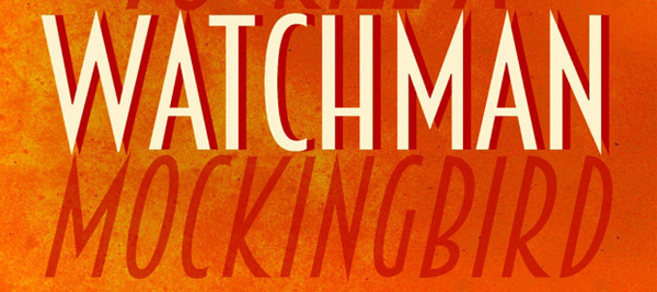
This week, the cover design for the UK version of the book was unveiled. It is a simple cover in stark orange with a black silhouetted bird on a branch. Giving nothing away about the story itself, there are obvious strong overtones of the original novel. A ‘From the author of…’ tagline is a common feature of book cover designs. But the manner in which this element is integrated into the design here is smart and subtle, the Mockingbird title cleverly forming the shadows of the Watchman letters (however, some have not taken this too well). It alludes to the large cultural shadow that the original, now classic novel casts over this sequel. With the title of the original being so visual, it probably wasn’t necessary to also include a literal mockingbird on a branch, but that part of the illustration is still nicely executed and not overly prominent.
The new cover is being used as a broader visual identity for the book with the orange colour, textured background and main design featuring heavily on Facebook, Twitter, Tumblr and Instagram accounts. Even without the controversy, this is a big book launch and the cover is a fitting design.