As a graphic design studio in Newcastle we always take note of what’s happening in the wider design world. Lots can happen in just one short week so here’s a quick roundup of some of the bigger stories we’ve followed from the past seven days.
Use our quick links to read about:
YMCA gets a facelift / Brazil’s Nameless Mascots / Obligatory Christmas Item No. 1
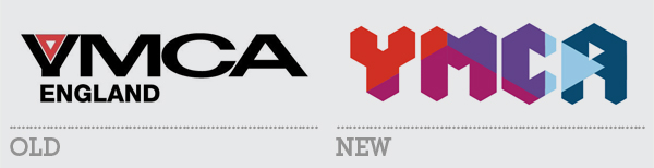
The YMCA is the world’s oldest and largest youth organisation, as well as the most famous thanks to the Village People. It spans 119 countries and is independently run in each one. Last year the US branch of the organisation rebranded and this week YMCA England has done the same, albeit with markedly different results.
The old logo was very poor. The stretched black font and squat Y – which looked more like a V – was harsh and unpleasant to look at; and the red triangle only served to lend a somewhat sinister edge to the whole lockup. The concept of the triangle is ingrained in the identity of the organisation as it represents ‘mind, body and spirit’, elements that the YMCA has traditionally looked to support.
YMCA US logo - The 'Y'
Unlike the US branch identity, which retains an obvious triangle device, the new YMCA England logo instead uses the triangle as a basis for a grid system upon which the word mark is constructed. It leads to an interesting and relatively pleasing letterform design that is unfortunately let down by the rotated triangle counter form of the A. The need to have a more obvious triangle motif causes an awkward, off-kilter aesthetic with the letter that makes it look like a mistake. Which is a shame because the approach taken here is much stronger and more compelling than the bubbled chevron logo of its American counterpart. It is reminiscent of both the New York City Tourism and Melbourne City identities, both recent and successful rebrands.
The broader visual identity is bright and energetic without being too gaudy, extending the triangular grid patterning to coloured backdrops and text containers. All in all, a big step away from the old brand and its outdated misconceptions about the organisation and a decent platform on which to build greater cohesion and exposure for the YMCA.
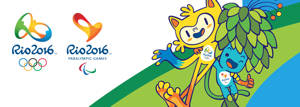
With the World Cup now a distant Summer memory, Brazil is starting to gear up for their next big hosting gig, the Olympic Games. With the logo already set up, the only thing missing from the burgeoning branding project was the Games mascots. A tradition since Waldi the Dachshund headed up the 1972 Munich Games (although the 1968 Winter Olympics in Grenoble had an unofficial mascot in Schuss, the ball on skis), Olympic mascots are now just as important a part of Games’ identities as the logos or events icons.
The 2010 Winter Games in Vancouver was the first time that both Olympic and Paralympic mascots were unveiled together. And following London’s lead, Rio have opted for two characters, one for each Games. The new cartoon creations represent the fauna (Olympics) and flora (Paralympics) of the host country. The official website gives short descriptions of each mascot:
Olympics (the yellow cat/monkey creature)
“I’m a mixture of all the Brazilian animals. I was born out of the explosion of joy that happened when they announced that Rio would host the Olympic Games. (I want) to spread joy throughout the world and celebrate the friendship that flourishes between people from all over the world at this super sports event.”
Paralympics (the blue and green plant thing)
“I’m a magical creature, a fusion of all the plants in the Brazilian forests. (I want) to inspire everybody to use creativity and determination to always reach further and have fun..”
The website also gives information about where the mascots live, what they like doing and even what their special powers are. The characters are nicely illustrated and far more engaging than the sinister metallic cyclopses that were used for London 2012. They are colourful and charming and likely to help shift a load of Games merchandise to children all over the world. Having them represent flora and fauna also helps imbue each with its own personality rather than just doubling up the same idea (as London did with Wenlock and Mandeville).
The mascots are currently unnamed. The website features the chance for visitors to vote on what these two should be called – a useful if somewhat limited way to engage early on with Brazil’s Olympic audience. For a bit of fun, check out BrandChannel’s rundown of Olympic mascots.
Today is Black Friday, historically only a notable date for Americans as it’s the name given to the Friday following Thanksgiving, and as such one of the biggest days of the year for shops and retailers. But the tradition has spread worldwide in recent years – in the UK mainly because it tends to coincide with the last monthly paycheque that can be used for gift shopping before Christmas. As such it is widely regarded as the first day of the festive spending season. Which means we’re only a couple of days away from December and less that four weeks from the big day. It seems that from now until then, any round up of weekly stories should include an obligatory Christmas piece. So here’s this weeks:
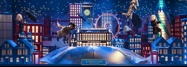
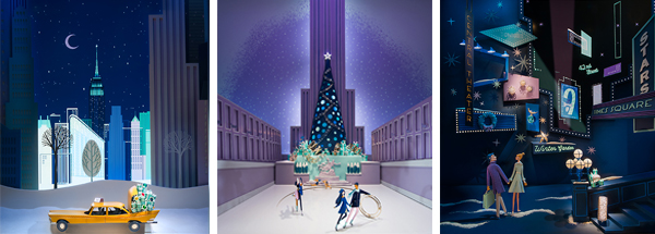
Coinciding with the annual spectacle of the Fenwick Christmas windows currently pulling in the crowds in Newcastle, Creative Review released a list of the best Christmas window displays on their blog. Such festive displays are a big deal and the larger department stores take a great deal of time and pride over those wide areas of retail real estate to try and tempt passing shoppers into their clutches. It really takes something special to stand out from the highstreet window crowd but some on the list have really excelled. From the magic and fairy-tale wonder of Harrods and Selfridges to the extravagance of Barney’s and the quirkiness of John Lewis (centring their display on the penguin theme of this year’s TV advertising).
Tiffany's 1950's-styled paper cut window displays
But I think the winners have to be the 1950’s minimal elegance of Tiffany’s and the sweet storytelling puppetry of Printemps/Burberry. Head over to the Creative Review blog to see the full list.