As a graphic design studio in Newcastle we always take note of what’s happening in the wider design world. Lots can happen in just one short week so here’s a quick roundup of some of the bigger stories we’ve followed from the past seven days.
Use our quick links to read about:
The end for Nokia / Limited Edition Bear Snacks / The new World Cup Logo / Barry Island’s Colourful Wall
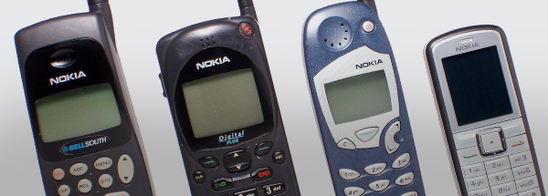
In April of this year, the mobile handset division of Nokia was taken over by Microsoft. After endless rumours and speculation over the last few weeks, Microsoft have announced that they will be removing the Nokia branding from the phone handsets to be replaced by the Microsoft logo. Effectively, this signals the death of Nokia as a mobile phone brand.
For many, this is sad news. Nokia was once the mobile phone manufacturer. It dominated the early years of the burgeoning mobile market and its name is irrevocably linked to many people’s first experience of mobile phones. At the forefront of the technology throughout the 1990s, its 3310 handset, launched in 2000, became one of the most successful mobile phones ever whilst its 1100 handset is still the best-selling mobile phone of all time. It was the first company to recognise the potential of the mobile phone as a handheld games device when it released the N-Gage in 2003.
Whilst the company hasn’t faired so well in the smartphone era, it is still a well-loved brand with consumers. From 2000 to 2010, it appeared in the top ten of Interbrand’s 100 Best Brands list, many times in the top five. This year it was still in the list, at number 97. Losing such a well-regarded brand with so much equity – not to mention nostalgia – invested in it has caused upset from many quarters. This may cause Microsoft a problem in trying to relaunch the Lumia phone division under their own umbrella brand. They will need to do a significant amount of work to win over a consumer base who are frustrated to lose such a longstanding manufacturer in the mobile marketplace.
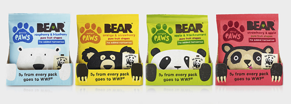
Bear is a company who make and sell fruit based snacks, particularly aimed as pre-school and school age children. As a start-up company they realised the importance of a strong brand in differentiating themselves in a crowded marketplace. They enlisted B&B to create their visual identity and packaging, a smart, consistent aesthetic utilising hand-crafted fonts, cut out shapes and strong bold colours. The brand has since won awards and helped elevate the company’s products to must-haves on many parents’ shopping lists and in kids’ lunchboxes.
Recently, Bear launched a limited edition packaging set for one of their products – Bear Paws. Partnering with WWF – who will receive 5p from every pack sold – the company is using its strong visual identity, as well as its felicitous company name, to highlight the plight of endangered bear species. The four snack flavours adopt a different bear for their packs including polar bears, pandas and sun bears. The idea itself is great but the pack graphics elevate it even further. The bear characters are wonderfully illustrated, each one distinct and individual whilst also fitting perfectly with the core branding. The graphics are fun without being overly childish – which could have undermined the packs’ important message. All-in-all a great example of a company with a strong and confident visual identity using its strengths to draw attention to an important cause.
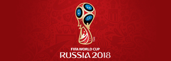
The World Cup seems to have made a bigger impression on a broader audience this year than ever before. As a result the new logo for World Cup 2018 has made a greater impact on design blogs world-wide than past years since its unveiling on Tuesday (no doubt helped by the event partly taking place on the International Space Station). It’s a fairly complex logo that tries to cram in an inordinate amount of allusions and impressions of both modern and historical Russia – from St Basil’s Cathedral and Fabergé Eggs to Sputnik and mankind’s determination in reaching for the stars.
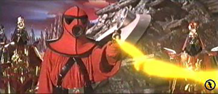
As it has sparked debate on blogs around the world it has also attracted the inevitable mocking internet criticism (some have likened it to Edvard Munch’s ‘The Scream’, a 3 blade rotary shaver and Rey Mysterio’s mask – so as not to be left out, it actually made me think of this guy from Flash Gordon). But criticism aside it is actually a pretty decent logo, especially in comparison with the effort for this year’s tournament. The Brazil logo was woeful with it’s weird marigold gloves forming the shape of the trophy.
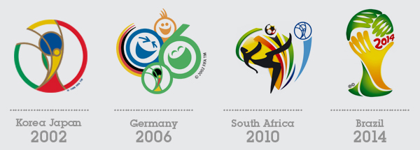
Interestingly, only the logos of tournaments held in the 21st Century have featured the actual trophy (although Germany and South Africa just appropriated Korea/Japan’s iteration). This latest version is by far the best. Despite the numerous elements at work in the design, and the rather odd black and blue ‘magic windows’, it is well executed and makes for an attractive brand mark for the competition. Obviously it’s very early days so we haven’t seen examples of how it will be deployed or how the visual identity will be extended across the full range of media. But as a central logo for a global sporting event this is a surprisingly good starting point.
As an added extra, take a look over all the other ‘logos’ of the World Cups here (although the designs from before the 1960s stretch the definition of logo). For iconic status, it’s hard to beat Mexico 70 – a logo that has recently had a rebirth in replica posters and t-shirts.
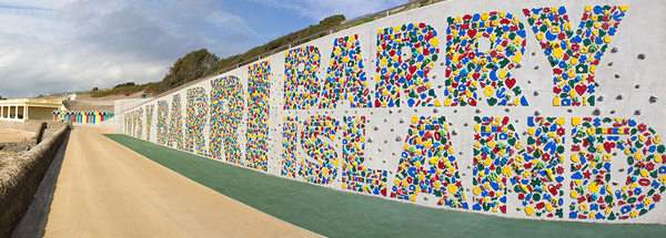
I should declare from the outset that up until this week my only knowledge of Barry Island was as a primary location in the sitcom ‘Gavin and Stacey’. However, I now know that is is home to a fantastic 40-foot long climbing wall come art installation. Located on the seafront, the latest part of Barry Island’s Eastern Promenade regeneration programme, the wall is magnificently decked out in colourful shapes forming large letters that spell out ‘Ynys Y Barri Barry Island’. The project was created by artist Gordon Young who has transformed a previously neglected area of the seafront into a real landmark and tourist attraction.
‘I had been looking at ways to use recycled plastics for a while and it worked well for this – it’s affordable, colorful and resilient against salt water. It’s a material we have so much of, but often don’t really know what to do with, and I think it could be used a lot more.’
There is a lot going on in this project. All of the colourful shapes used on the wall are cut from recycled plastic, a material the artist was keen to utilise. Interspersed amongst the flat cut-outs of sea life, fossils and holiday items, are a broad range of similarly coloured climbing holds. Visitors can climb up the wall using the holds (which form a range of routes from beginner to experienced) or traverse along the wall, one end to the other. And as well as the shapes and holds, the large letters also contain words related to local themes.
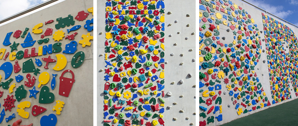
This is a big scale art piece and a functioning, fun tourist attraction both at the same time. It has something to appeal to everyone visiting the seafront, children and adults, passersby and have-a-go climbers. Hopefully the landmark will help to single Barry Island out as more than just a sitcom location.