As a graphic design studio in Newcastle we always take note of what’s happening in the wider design world. Lots can happen in just one short week so here’s a quick roundup of some of the bigger stories we’ve followed from the past seven days.
Use our quick links to read about:
Innocent’s Birthday Labels / Kalashnikov: The new Apple?Farewell Clip Art / Obligatory Christmas Item No.2

Innocent Smoothies have a brand strength and consumer loyalty that is the envy of many of its rivals. The simple graphics, fun packaging, socially responsible attitude and friendly, humorous personality have all helped the young company to rank amongst the top ten drinks brands in the UK and to expand globally. Despite now being owned by Coca Cola, the Innocent brand maintains its successful attitude and its loyal following.
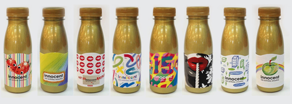
To celebrate the company’s 15th birthday, they commissioned designers and artists (including Kate Moross, David Airey and Ben the Illustrator) to create a set of celebratory labels. The outcomes of the brief – what would you do if you were in charge of the Innocent labels for a day? – are a mix of styles, from simple coloured pencil shading to complex overlaid vector shapes. It’s a fun way for the brand to celebrate a big birthday – head over to the Innocent blog for more information on their golden bottle labels.
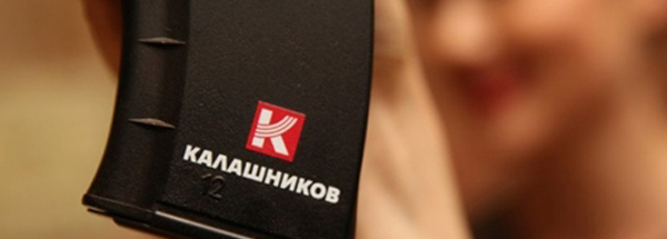
If Innocent Smoothies are this week’s ‘good’ then Kalashnikov are the ‘bad’, or at least the morally dubious. Creative blogs have been lit up over the last few days with commentary on the weapon manufacturer’s new rebrand, unveiled in Moscow on Tuesday. The company has invested in a full top-down rebrand covering the main parent company – now called Kalashnikov Concern, or just Concern – and it’s subsidiaries; Kalashnikov Combat Weapons (including the AK-47), Izhmash Sports Rifles and Baikai Hunting Rifles. What’s causing the real fuss on design blogs is not the new logos themselves, but the marketing pitch that is accompanying them. Concern are looking to reposition themselves as manufacturers of peace defenders rather than killing tools. It’s an emotional topic for most people and even the most objective of commentators have levelled some criticism at the company for promoting themselves as the peace-loving advocates of freedom fighters and positive revolutionaries the world over.
It’s difficult to give an unbiased, objective assessment of the actual design work utilised in this rebrand given the client involved. It seems like this should have been a quietly rolled out identity change, one noticed only by weapons industry insiders. Instead it has been heralded and trumpeted in a glitzy, self-congratulatory party with company officials claiming they want to be ‘as recognised and valuable’ as Apple. The logos are well-executed and succeed in delineating the repositioned sub-brands. But the illustrative elements of the designs – the main Concern logo alludes to a bullet fired from a gun and the Kalashnikov logo features the iconic curved magazine clip of the AK-47 – serve to remind us that this is an identity revamp for the manufacturer of the world’s most ‘popular’ weapon and as such, it’s difficult to look upon the project from an entirely positive perspective.
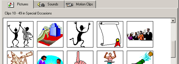
And so we get to the ‘ugly’. This week Microsoft announced on its blog that it would be finally getting rid of its built in clip-art library. Having already been jettisoned from Office 2013, it will now be removed from Office.com and replaced with a Bing ‘royalty-free’ image search. Obviously, clip art will still be available on websites and in Google searches but Microsoft’s move still marks the end of a particular era in personal desktop design and printing.
Launched in 1993 with Microsoft Word 6.0, the native clip art collection served as the quick and easy option for adding graphics to presentations, letters, invitations and business cards. The use of clip art was so simple to employ that it became immensely popular during the 1990s, so much so that its ubiquity had a similar effect as the constant misuse of Comic Sans. Many of the illustrations were poorly designed or utilised a particular style that very quickly dated. Eventually, clip art came to symbolise poor design and a lack of creativity. With the increase in the use of online image search options and the continued derision of clip art, it declined in use in the 2000s. Finally, some may say thankfully, it has been put out to pasture. Very few will be sorry to see it go but there’s no denying a nostalgic fondness for the goofy illustrations that adorned many a school presentation and bubble-jet printed birthday card.

Finally it’s December and the Christmas shopping is well under way (isn’t it!). FADS, a contemporary furniture retailer, is celebrating the yuletide season with a nicely designed infographic to educate us all on the more unusual festive traditions from around the world. Straw goats, Christmas pickles and Japanese KFC all feature on the list. But the title of weirdest tradition has to go to the character of Caganer from Spain, Italy and France – a small man going to the toilet in the Nativity scene!