As a graphic design studio in Newcastle we always take note of what’s happening in the wider design world. Lots can happen in just one short week so here’s a quick roundup of some of the bigger stories we’ve followed from the past seven days.
Use our quick links to read about:
Coca-Cola brand revamp / Final farewell for the walkman? / Brands on the band wagon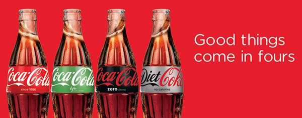
Coca-Cola is keeping itself in the news at the moment – last week with the 100th birthday of their iconic ‘contour’ bottle and this week with an overhaul of their drinks brands. It’s a tough time for soft drinks like Coke; maintaining strong customer loyalty in the face of increasing concern over sugar levels and health issues is an uphill battle. In an effort to turn around faltering sales the drinks giant is overhauling its packaging and promotional material across its four primary brands – Coca-Cola, Diet Coke, Coca-Cola Zero and Coca-Cola Life. Originally a one-brand company, Coca-Cola has introduced their different products over the years without a clear unifying message. This has caused confusion among consumers, many of whom are not aware of the differences between the drinks. This new ‘one brand strategy’ – essentially creating a stronger Coca-Cola master brand – will unite the four drinks visually and promotionally and help consumers to understand the variations between them, particularly the no-sugar and low-sugar options.
The new packaging designs see the Coca-Cola logo increased in size and rotated from vertical to horizontal. On the Diet Coke cans (always the sore thumb in Coke’s packaging range) the slab serif Coke font has been dropped and the full name now mirrors the font and layout of the main Coca-Cola logo. The calorie and sugar content describers are now front and centre below the logos making it easier for buyers to understand the nature of the drinks. The marketing has also been adjusted to make the most of the revised logos and colourways and all advertising from here onwards will feature all four drinks rather than them being individualised. The rollout across the UK begins in May, which will see the rebrand getting four months of airing before taking centre stage as sponsor of the Rugby World Cup in September. Click here for the full official press release.

New Coca-Cola drinks can designs: Left - UK & Europe / Right - Spain
Interestingly, whilst this new brand strategy will be adopted across Europe and partially in the US, Spain have gone in their own direction. Though still adopting a ‘one brand’ system and applying similar graphic revisions – such as the rotation of the main logo – the Spanish rebrand maintains a heavy red colour scheme with only the colours below the ribbon changing. It is a strange choice; the failure to differentiate the drinks through strong individual colourways only serves to increase confusion about which drink is which – not to mention that there is a ‘Zero’ drink and a ‘Zero Zero’ drink both featuring black and red cans.
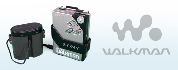
The Walkman is an icon. The name is synonymous with personal music, freedom, portability, state-of-the-art technology. From its launch in the late 1970s it became so widely known and ubiquitous that Walkman joined the ranks of Hoover, Velcro, Trampoline and Bubble-Wrap as a brand name used to generically describe a whole product sector. Even through Sony’s panicked years in the 1990s where it struggled to forge a new music medium with the Mini-Disc, the Walkman name endured. And when Sony finally threw in the towel and accepted defeat to the upstart iPod, the name made its way onto their MP3-enabled mobile phones as a nostalgic link to their past music glories. Now it seems that this final connection to the pioneering music player is being cut. The Xperia M4 Aqua and Z4 tablet unveiled at the MWC this week were missing the Walkman brand. It was replaced with a generic ‘Music’ app. Sony reps apparently confirmed that this Music name would replace Walkman going forward.
It is possible that Sony has chosen to remove the branding from its mobile device lines in order to concentrate on developing a new breed of Walkman digital music players. At CES 2015 in January, they showed off the new Walkman NW-ZX2, a dedicated music player with a price tag of £950. However, if this is the future for the Walkman, it will probably be short-lived; the diminishing demand for standalone MP3 players, along with the eye-watering retail price, will likely make this the final swan song for a once invincible brand.
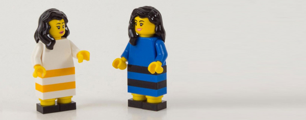
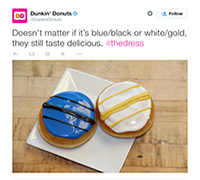
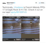
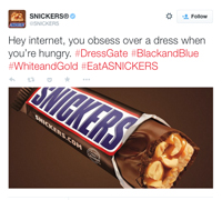
We tried really hard to resist mentioning the ‘dress that broke the internet’ in this roundup. However, the ridiculous viral nature of this innocuous photograph is actually worthy of a small amount of scrutiny. The level of manic social media engagement that the dress photo achieved is impossible to plan or predict – only on very rare occasions can a brand actively generate such interest. But what can be controlled is the manner in which brands react to these flash-in-the-pan memes. In this case, the results of companies jumping on the dress picture band wagon ranged from the lame (numerous tweets of “We think it’s [our brand colours]”), to the great:
 |
 |
 |
|---|
Utilising social media for marketing purposes is still a precarious route for many brands and seems to result in failure more often than success. But linking your brand message to the latest internet talking point can be a great way to engage with your audience and get your company involved in those water-cooler discussions.
Another interesting aspect to this story is how the company that actually manufactured the dress responded to this unprecedented and unexpected exposure. Roman Originals weren’t mentioned in the original Tumblr post but they moved quickly and intelligently to capitalise on the opportunity it presented. Tracking the development on social media and utilising real time data through the ad tech company Quantcast, Roman Originals quickly created targeted ads playing on the colour confusion. They also updated their homepage and sent marketing materials to their stores to update window promotions. Visits to their website grew to 1.2million and views on the product page of the dress itself increased 3000%. Whilst it’s difficult to generate such interest independently, Roman Originals’ reaction is a great example of a brand responding intelligently to a surprise social media opportunity.
As for the dress itself, this article from Brand Republic nicely addresses what brands can learn from the image and the psychological roots of its divisive nature.