As a graphic design studio in Newcastle we always take note of what’s happening in the wider design world. Lots can happen in just one short week so here’s a quick roundup of some of the bigger stories we’ve followed from the past seven days.
Use our quick links to read about:
‘Berlin Wall’ Light Balloons / The Lennon & McCartney of fonts Royal Mail’s Christmas Stamps / John Lewis’s Penguin
Visualization of the LICHTGRENZE at Brandenburg Gate
Amazingly, this Sunday – 9th November – will mark 25 years since the fall of the Berlin Wall. Such a momentous occasion in world history is being commemorated this weekend with a number of events in Berlin including tours, exhibitions and movies. One of the most prominent displays will be a line of 8000 lighted balloons set along a section of where the wall stood for almost 30 years.
The temporary frontier – called Lichtgrenze, meaning ‘border of light’ – is a fitting memorial to the barrier that divided the city, and the country for so long. The use of the lighted balloons alludes to the candle-lit demonstrations held during the Peaceful Revolution in 1989. Stretching for almost 15km, the installation passes many famous, and infamous, Berlin landmarks including The Riechstag, Brandenburg Gate and Checkpoint Charlie. At intervals along the route, panels will show photographs and tell stories of people and events related to the Berlin Wall; escape attempts, protests and political propaganda from the era.
Visualization of the LICHTGRENZE at Checkpoint Charlie
It is a visually evocative installation, using light to demonstrate both the impact that the wall had on those who lived in its shadow as well as the elation of those who witnessed its fall. On the Sunday evening, all of the balloons will be released in a final commemoration of the reuniting of the two sides of the wall. For more information about Lichtgrenze and the weekend’s events visit the official website: www.berlin.de
Photographs © Kulturprojekte Berlin_WHITEvoid / Christopher Bauder, Photos: Daniel Büche.
At the end of last week, BusinessWeek reported on the settlement of the $20 million lawsuit that has been raging between two legendary typographers since the beginning of the year. Fonts are not everyone’s thing and so the names of Jonathan Hoefler and Tobias Frere-Jones probably mean little to the vast majority of people, even to many designers. However, many of the typefaces that their company – Hoefler & Frere-Jones – created over their 10 year partnership will be immediately recognisable, appearing as they have in magazines, movies and a presidential election.
The pair individually won awards for their typeface work and were the first typographers to be recognised by the US National Design Awards. Their work is featured in permanent collections at both the Smithsonian Institute and the Victoria & Albert Museum. They have been described as The Beatles of the type world, although basic numeracy says that a closer equivalent would be Lennon and McCartney. To extend the analogy (further than I should) their Gotham typeface, used by the Obama campaign in 2008 and the sans-serif choice of many designers ever since, was like their ‘Hey Jude’.
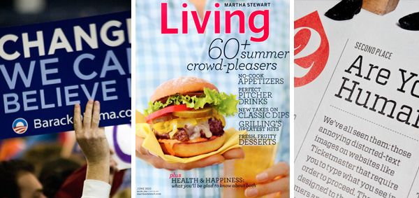
HFJ fonts in use: Gotham (Obama '08) / Archer (Martha Stewart Living) / Vitesse (Fortune 500 report)
So when, like The Beatles, they split at the beginning of 2014, it came as a shock to anyone familiar with their work. And more surprising was the acrimony involved. Frere-Jones, who launched the lawsuit against his former partner, called Hoefler ‘a first rate scam artist’ for denying his right to a 50% share of the revenue generated by their partnership. Hoefler denies Frere-Jones was ever a partner, recognising him only as an employee of the company. The public bitterness between the two ran on throughout the year until the case was eventually settled – the details of which have not been fully disclosed. It is a sad end to an amazing design double-act. However, as many have commented. Frere-Jones is now free to set up his own foundry and there is anticipation to see what he achieves in the absence of his former partner.
End note: Hoefler and Frere-Jones’s acrimonious dispute was actually resolved at the beginning of October so isn’t really this week’s news. However, the BusinessWeek article was published last Friday and served as a convenient launchpad that allowed me to rattle on about fonts and The Beatles.
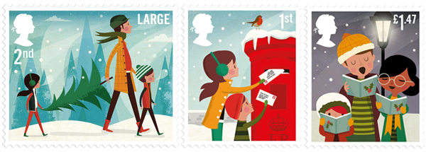
So Halloween and Bonfire Night are over and done with for another year and now it’s the inevitable, inexorable downhill slide towards Christmas. And along with the unveiling of Fenwick’s Christmas windows, the first landmark of the festive season is the release of the Royal Mail Christmas stamps.
This year the Royal Mail’s brand agency – True North – engaged American illustrator Andrew Bannecker to create a number of iconic secular yuletide scenes for the stamp set – ice-skating, posting letters to Santa, carol singing, snowman building and buying the Christmas tree. The designs are crafted in Bannecker’s idiosyncratic style – a mixture of vector illustration and scanned painting textures – giving them a nostalgic aesthetic that makes them perfect for the stamps. There is a charming, retro feel to the illustrations, almost like they are taken from a 1950s magazine. They bear a striking difference to last year’s stamp sets of which there were two – one a collection of children’s drawings, the other a series of traditional Madonna and Child paintings. As always, the stamps are fully Queen endorsed. See the full set here.
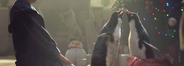
All of the other stories this week seem to pale into insignificance compared to the launch of John Lewis’s new Christmas advert. What is truly amazing is the effect that the commercials continue to have.
John Lewis broke back into television advertising in 2007 after a three year break with a minimalist ad called Shadows. This set a standard for their smart, engaging commercials but it wasn’t until 2011’s offering, The Long Wait, that the ads became cultural landmarks. Featuring a boy counting down the days until Christmas – excited about giving his presents rather than getting them – this was the first one to feature a narrative style rather than a series of tableaux and was a genuine hit with the public.
This was topped the following year with a tale about a snowman trekking through storms to get his snow-girlfriend some gloves and a hat. But last year’s Disney’esque The Bear & the Hare set a new benchmark and is likely to be the most enduring of the lot. In the short time that the company has been creating them, only seven years, the John Lewis Christmas advert has become a full blown festive event.
The latest commercial is about a boy and his penguin – these are always better being watched fresh rather than described so if you haven’t seen it yet, watch it here. What is particularly admirable about the John Lewis campaigns is the way in which they extend the advert into a broader experience, building a short-term seasonal brand which is experienced in each store. Last year, the stores were decked out with small viewing corners dressed to look like caves with TVs showing extended versions of the animated commercial. This year, the company has partnered with Microsoft and devised a truly original touch point for their school-age consumers – a ‘Kinect 2-enabled 3D interactive experience’ that allows children to scan in their favourite toys and watch them come to life on screen. This will be in conduction with a children’s book (and e-book version), soft toy Monty penguin, online game and other related merchandise and in-store promotions.
It’s no revelation to say that Christmas is highly commercialised but John Lewis are able to build their sales and elevate their brand whilst at the same time actively contributing to the goodwill of the season and engaging with their customers in a way that few other retailers seem capable of. This year, with the help of Monty the penguin, they look set to reap the benefits of that approach yet again.