Noticed something different when switching on your laptop this morning but just couldn’t put your finger on what it was? Don’t worry, there’s no need to book an appointment at the opticians just yet: Microsoft have just redesigned all of their Office 365 icons.
Microsoft recently announced plans to modernise their Office 365 app icons to reflect product changes and the new ways in which people are working. The initiative has seen a complete design overhaul for the icons of the suite’s hugely-popular apps, which include Outlook, Word, PowerPoint and Excel.
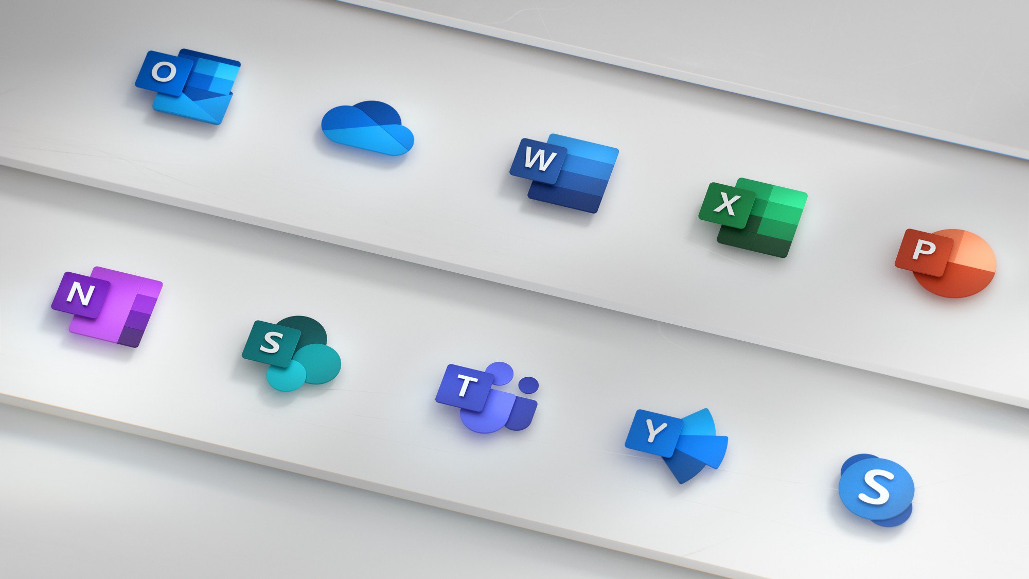
The change is quite a leap from the icons’ previous look, which Microsoft hadn’t altered for more than five years – and even then the difference was minimal. The new design sees the letters of each app positioned straight-on in a new square icon with rounded corners and an improved symbol-to-letter ratio. While each icon now has a unique and identifiable symbol, there are connections within each app’s symbol and the collective suite.
Colour also now plays a much bigger role in making each icon more recognisable with the use of brighter hues and changing gradients of colour for a stylish 3D effect.
Jon Friedman, the head of Microsoft Office design, said “From the get-go, we embraced Office’s rich history and used it to inform design decisions. Strong colours have always been at the core of the Office brand, and new icons are a chance to evolve our palette. Colour differentiates apps and creates personality, and for the new icons we chose hues that are bolder, lighter and friendlier — a nod to how Office has evolved.”