As a design studio based in Newcastle upon Tyne we always keep an eye on what’s happening in the world of design. A lot can happen in a week, here are just a few of the stories that caught our eye recently.
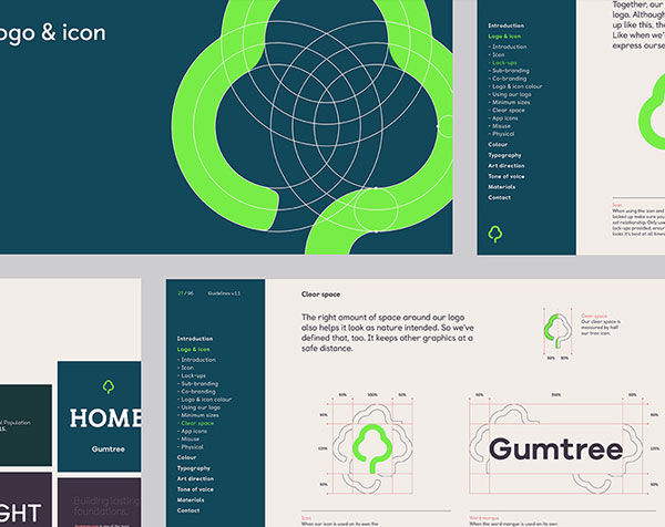 After 16 long years, listings website Gumtree has brought their brand up to date. The decision was made to renew the logo after customer feedback revealed widespread negativity towards the existing mark. Agency Koto created the new design based on a brief to come up with a logo that was modern, simple and digital. With 80% of users accessing the site via mobile it had to be functional for both mobile application as well as looking great in print.
A simple tree design has been created that is very functional and clean, alongside a much more modern typeface which is far better suited to a digital application.
The new brand is a huge step forward for the Ebay owned company, expect to see a roll out over the coming weeks with advertising, mobile app and twitter accounts all launched to coincide with the new look.
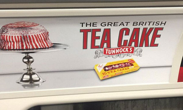 Scottish confectioner Tunnock’s have lost the iconic lion from it’s logo in a ‘British’ themed advertisement aimed at selling more products within the English market.
The advert, placed on the London Underground network has angered some Scots who see the move as a rejection of the brands roots. Managing Director Boyd Tunnock defended the advert saying it was designed to take advantage of the popularity of the BBC’s Great British Bake Off show and the lion icon was still present on packaging.
The move seems a little ill-advised with the brands core following being Scottish but the country did vote to stay within the union with the UK recently and so the brand has every right to be proud of their British heritage.
It may all just be a storm in a teacup – the increased publicity of the product may even result in a surge in sales for the company – I’m certainly going straight to the shops to pick up a pack!
![]() BBC Three faced criticism last week when it revealed a new logo as part of the channels rebrand. A roman numeral inspired ‘three’ but with an exclamation mark in place of the last numeral has been likened to a logo design from a scene in the corporations comedy show W1A, which mocks the channels marketing culture. Many have questioned the logo’s resemblance to adidas or a hamburger website menu; it has also been highlighted that the logo doesn’t say ‘three’ at all.
BBC Three faced criticism last week when it revealed a new logo as part of the channels rebrand. A roman numeral inspired ‘three’ but with an exclamation mark in place of the last numeral has been likened to a logo design from a scene in the corporations comedy show W1A, which mocks the channels marketing culture. Many have questioned the logo’s resemblance to adidas or a hamburger website menu; it has also been highlighted that the logo doesn’t say ‘three’ at all.
The channel has defended it’s new brand design, saying it wanted to “be bold and create something new that will be around for years” and that the new logo was designed to work across both TV and as an App icon.
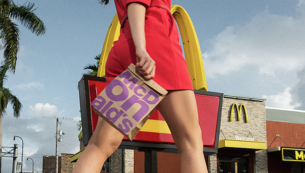
What do you get when you bring one designer from seven design agencies together in London for a week; the answer is McDonalds new packaging for its food and beverages.
Tasked with creating packing that would lead to the company becoming more modern and progressive, a simple and fresh approach was taken. The introduction of bright colours such as purple, green and magenta were added as well as the inclusion of large bold typography. This stripped back approach which lets the brand’s key assets speak for themselves is McDonalds reaction to its cooler new fast food rivals.
The redesign forms part of a larger plan by their new CEO to re-ignite the excitement around McDonalds.
Consumers will start to see the packaging itself start rolling out in the US this month, with it eventually reaching our shores sometime this year.