As a graphic design studio based in Newcastle we always keep our eyes open to whats happening in the wider design world. Lots can happen in just one short week, so grab that first coffee of the morning, and read the stories that caught our attention over the last seven days.

Last week Coca Cola launched its new limited edition ‘no labels’ cans for the Middle Eastern market for the month of ramadan. This forms part of Coca-Cola’s umbrella campaign to try and fight prejudice, “Let’s take an extra second” campaign. The message behind the stripped down cans: don’t label other people. According to the consultancy who created the campaign, FP7/DXB based in Dubai, it helps to promote a world without prejudices.
In removing the famous script from the new cans, all that is left is the brand colour with the naked white ribbon leading the line. This in itself says a lot about todays branding landscape without actually saying anything at all, and the position companies try and place themselves in.
Corporate logos are constantly evolving faster with the purpose to become simpler, as mentioned last weeks blog post Facebook is one of those examples.
In the end Coca-Cola’s enduring look can always go simpler without sacrificing its design identity; everyone knows their brand colours, and the ribbon is strong enough to let us know what’s in store when we pick up that can to open.
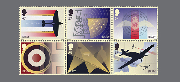
To mark the 75th anniversary of the Battle of Britain, the Jersey Post is releasing a beautiful set of iconic graphic stamps created by hat-trick.
Obvious influences and inspiration seems to stem from poster designers of the time such as Abram Games who was the official war poster artist and responsible for over 100 iconic posters during this period in Britain, his use of strong composition and layout seems to have heavily influenced the ideas and emotions these stamps were set to portray.
Hat-trick designed the stamps entirely in-house with original imagery, rather than using historical photographs or elements. Detail seems to play a key factor in this set of stamps as we see miniature text worked into each design relating to a different aspect of the Battle.