As a brand consultancy based in Newcastle upon Tyne we always keep a look out for what’s happening in the wider world of design. Much can happen in one week, so grab a coffee and take a look at a few of the stories that have caught our eye over the past seven days.
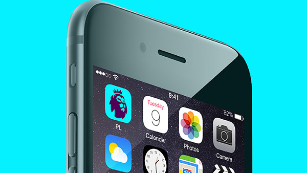
 A new logo has been revealed for the Premier League, following the decision to ditch title sponsorship and after a six month project led by DesignStudio.
Initial research showed that 90% of stakeholders liked the lion motif from the existing brand and so this was kept and developed into a more simplistic shape. The new lion shows only the head turned at a slight angle with the word mark now lowercase in a friendlier, custom typeface. The whole feel has been built around creating a less aggressive brand that has wider appeal and that is more practical for use across a range of media. The logo was designed with a “broadcast-first-approach” to ensure it worked as a simple app icon first and then considered for more complex applications.
The main “aubergine” mark colour works on a white background in more formal instances alongside a wider palette of brighter tones for use in less formal situations, allowing a system that is adaptable to all audiences.

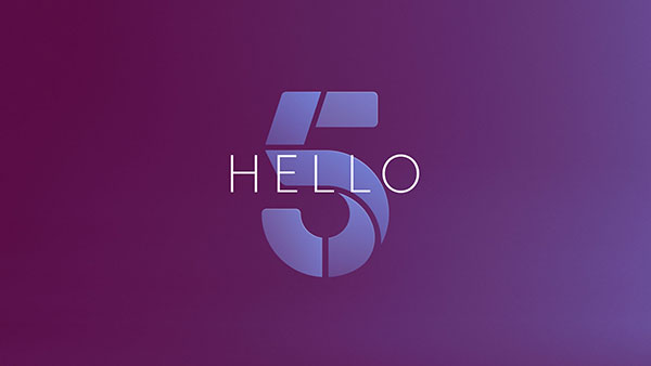
A six month project to rebrand the entire Channel 5 network of channels has been completed by their in-house team, in collaboration with other specialist consultancies. The new look spans across the main Channel 5 identity, 5Star, 5USA and the networks on demand player My5. A more sophisticated, high end look has been created with a composite number ’5’ made of several shapes which is designed to be flexible to suit different content moods.