As a graphic design studio in Newcastle we always pay attention to what is happening in the wider design world. Lots can happen in just one short week, so grab that first coffee of the morning, and read the stories that caught our attention over the last seven days.
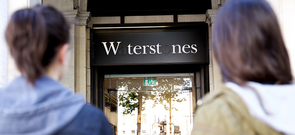
As part of National Blood Week, NHS Blood and Transplant revealed the “Missing Type” campaign, which has seen brands around the UK drop the letters A,O and B from their logos, to encourage people to give blood.
Brands including Odeon, Waterstones, The Mirror newspaper and Green and Black’s, as well as government bodies, 10 Downing Street and Transport for London, have all joined the campaign.
The NHS hopes the campaign will help to create intrigue around the missing letters and raise awareness of the need for blood donors across all blood types. This follows NHS research, showing that the uk needs over 204,000 new donors to come forward to replace people who can’t donate anymore and to make sure they have the right mix of blood groups.
Ultimately the campaign highlights that if not enough new people donate blood,these ‘types’ will eventually go missing in the years to come, and there won’t be enough blood available to help patients when they most need it. To support the campaign, NHS Blood and Transplant have asked the public to drop letters from their profiles and posts on social media platforms and post images of those who support blood donation, with the hashtag #MissingType.
Obviously just talking about it won’t solve the issue, so why not register, donate some blood and possibly save someones life.
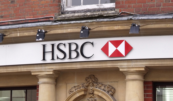
The HSBC name is apparently set to disappear from the UK high street as the group looks to rebrand its retail banking operations.
The news comes just as HSBC announced this week of a business restructure that could see it cut 8,000 jobs in the UK across its retail and investment operations. A total of 25,000 jobs could be axed globally. HSBC chief executive Stuart Gulliver also said the company will rebrand its UK retail branches, a move that will see the HSBC name and logo disappear from the UK high street.
There is speculation that HSBC could rebrand the banks by reviving the Midland Bank name. Midland Bank was one of the biggest banking names in the UK throughout the 20th century. It was bought by HSBC in 1992 and the name was phased out in 1999. Another option being mooted is for HSBC to bring its online banking brand First Direct to the high street. The rebrand plan comes ahead of new Bank of England rules – coming into force in 2019 – which will force banking groups to legally separate out their retail banking offers.
It will be interesting to see how such a well recognised bank will totally rebrand itself with a fresh identity, without the fear of losing or confusing its existing customers. Only time will tell how successful the rebrand will be, as Lloyds and TSB managed to do when they split into two, with Lloyds arguably having the stronger and revitalised brand.
 In 1965 one of the most ambitious and effective information design projects was launched in Britain. The British road signage system. It appeared on our streets for the very first time 50 years ago and has occupied an important role in our lives ever since, from instructing us where to go and a safe speed to travel at, to making us aware of any hazards or road works. The signs designed by Jock Kinneir and Margaret Calvert standardised the road network, creating many of the signs we see today and producing two new typefaces: ‘Transport’ and ‘Motorway’.
Kinneir died in 1994 but Calvert continues to work, most notably acting as a consultant on the recent Gov.uk project to redesign the UK Government’s website. Last month she was awarded the President’s Medal by D&AD President Mark Bonner. Later this month the road signs will be the subject of an exhibition and talk at Sheffield Design Week to celebrate the anniversary.