As a graphic design studio in Newcastle we always take note of what’s happening in the wider design world. Lots can happen in just one short week so here’s a quick roundup of some of the bigger stories we’ve followed from the past seven days.
We are drawing into the last few weeks of the UK General Election runup, and with such unbearable tension and rollicking excitement, its easy to forget that in the US, the countdown to their next election is just beginning. Of course, the two political systems are very different, not just is the lengths of the campaigns, but also in the manner in which the candidates promote themselves. In America, the start of the nomination chase is a chance for the potential runners to build their personal brands, – to construct a vision and a voice that will be used by previously local senators to speak on a national stage.
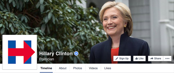
For Hillary Clinton, who finally announced her intention to run last week after months of teasing deferrals, this rebranding process is significantly more difficult. As a prominent figure on the US political scene for decades, she has an uphill battle in trying to overturn negatives preconceptions whilst also building on her previous achievements. Her starting point last week was a new logo and it brought in its wake an uproar of derision and micky-taking. The bold blue capital H with the dominant, red right-facing arrow invited comparisons to everything from a striped sailor’s vest with red anchor, the logo for a carnival cruise ship, a quarter of a swastika and – perhaps most provocatively – the plane hitting the Twin Towers.
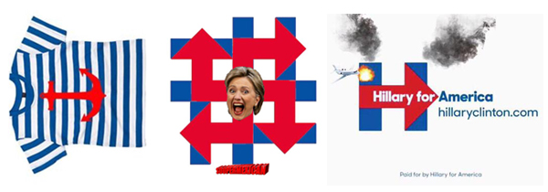
It seems clear that her marketing team are looking to create a similar visual identity to that of Obama’s 2008 campaign – a strong, simple logo alluding to honesty and progression, that can be reproduced on badges, bumper stickers, banners and t-shirts. It is a long way from the triumphant emblem used by Obama – lacking the elements of hope and unity that his ‘O’ conveyed – but these are early days and it will be interesting to see whether the Clinton campaign can harness any of the marketing nouse that took Obama to the White House.
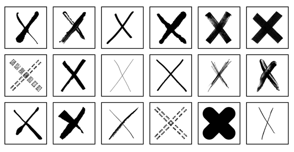
Back to the UK Election, and given the much publicised apathy among young voters, Pentagram have created their own campaign to help persuade the younger generation to get involved and get motivated to vote. The starting point for the project is a set of individually designed ‘X’s that can be downloaded and used as social media profile pictures. The idea is to get the disenfranchised voters enthused about using their vote, and proud enough to display that enthusiasm on their Twitter and Facebook pages. Speaking about first time voters, Pentagram partner Naresh Ramchandani said: “In their circle, voting is stigmatised. Showing you’re going to vote is an anti-stigma idea.”
Using symbols as profile pictures has worked prominently in the past, particularly during the marriage equality cases in the US Supreme Court during 2013. Then, the red equals sign of the Human Right Campaign overtook the social media sites of millions of followers including politicians and celebrities. Whilst the cause here is significantly smaller scale, it is no less important to many and Pentagram are hoping for similar traction with the UK electorate. They are reinforcing the campaign mission with a video explaining what is is stake when choosing to vote (or more importantly, when not bothering to). With only a 61% election turnout in 2010, there is an expanse of voters who could turn the tide of the election if they are suitably engaged enough to cast their ballot. It is hoped that this kind of project may help some to overcome their apathy in the last few weeks before election day. Visit the I Give An X website for more information.
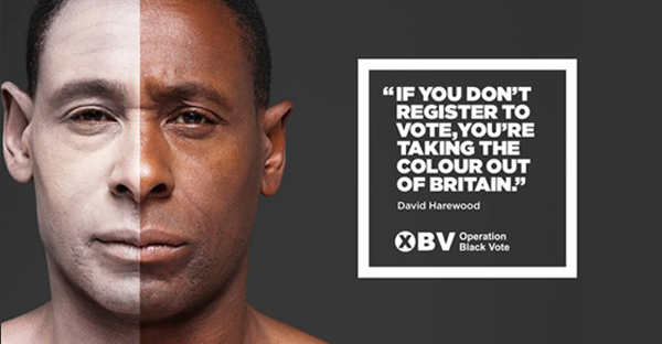
In general, election posters aren’t worth a second glance. The current raft of billboard wallpapers tend to involved poor photoshopping of one party leader in another leader’s pocket, or dancing on puppet strings held by another opponent. The last few weeks have seen the blunt message of wrecking balls and German roads. All in all, we’re a long way from the ground-breaking advertising of 1970s Saatchi & Saatchi. Instead, to see where the real interest and engagement is we need to look away from the main parties towards sideline campaigns such as Operation Black Vote and NoXenophobia.org.
Operation Black Vote, appropriately designed by Saatchi & Saatchi, is a series of striking posters featuring famous black personalities in white makeup. Along with young voters, there is a strong element of voter apathy in ethnic minorities, predominantly due to a feeling of not being suitably represented by the main political parties. The campaign aims to increase voter turnout within these demographics in order to help motivate greater ethnic diversity in government. The posters are bold and simple and involve a straight-forward honesty that is currently lacking in mainstream political advertising.
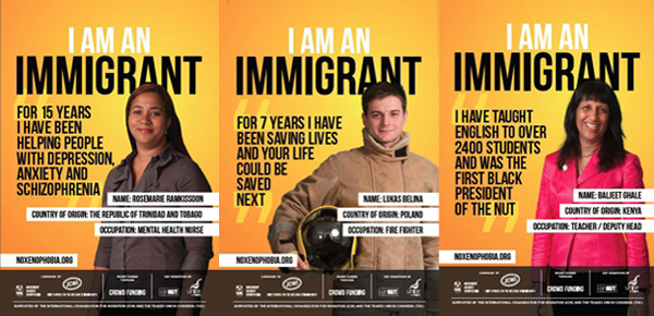
Immigration is always a hot topic come election time but this time around there has been a more unnerving undercurrent of xenophobia within the issue. The ‘I am an immigrant’ campaign is a direct argument against the issue’s usual political point scoring. Aimed as a counterpoint to the demonising of immigrants, the posters celebrate the roles that overseas migrants play within the UK economy and society. From firemen and doctors, to teachers, nurses and barristers, the posters present the other side of the issue in an informative manner. The design lacks the to-the-point minimalism of Operation Black Vote, but benefits from the positivity and pride on display that is also rarely utilised in big party campaigns.