As a Brand Communications Agency in Newcastle we always keep up to date with what’s happening in the wider design world. Lots can happen in just one short week so here’s our roundup of stories that have caught our attention from the last seven days.
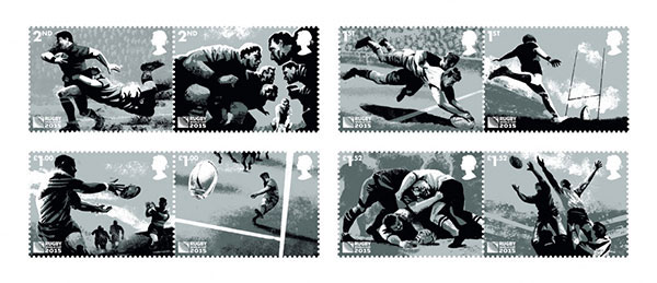
To mark the start of the Rugby World Cup 2015 the Royal Mail has launched a special set of stamps to convey the excitement and skill of the game.
Rather than concentrating on particular heroes and well known faces of the game or representing individual countries, design studio Hat-trick aimed to ‘represent the game of rugby as a whole’ showing different parts of play in each of the eight designs.
A gritty, monochrome illustrative style was used rather than colour – to avoid people associating the players with a particular team and show the raw energy of the game.
Lets hope it’s not an omen of the All Blacks winning then!
The commemorative stamps were released on Friday to help promote the tournament throughout the UK and beyond.
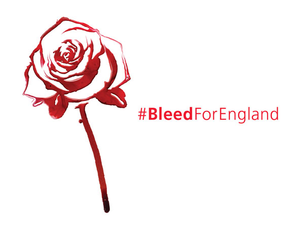
A timely campaign by The NHS to get more people to give blood sees Rugby stars making a blood donation for the first time. With less than three percent of the population donating, the NHS are aiming for 100,000 new individuals to register with the new campaign. Centered on a striking but simple TV spot which sees a red rose (the England team symbol) coming back to life; alongside a longer online film featuring stars of the game such as Jonny Wilkinson and Martin Johnson giving blood.
Using the blood donated by the stars, artist David Bayo created a blood rose motif for the campaign by painting the rose with water and then dropping a mixture of blood and ink onto the canvas to represent the flow of blood through a patients veins.
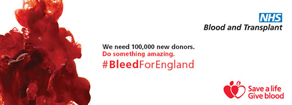
It’s a clever and timely campaign which will hopefully encourage fans to support their country both on the pitch and in a more important way off the pitch.
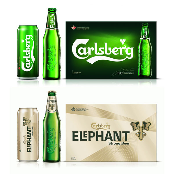
Setting their sights on the premium market, Carlsberg have launched a rebrand centered on their iconic hop leaf device. An eighteen month process has resulted in a simplified look which the company hope will make product range navigation easier and enhance the brand’s premium positioning.
It’s not a massive leap away from their existing look and feel but more a sensitive evolution of the brand to ensure more consistency and shelf stand out for the premium market.
The hop leaf shape which has been part of the brand for 100 out of it’s 168 year lifetime has been developed alongside a ‘shard light’ graphic device which extends around the leaf and is used across all lines to build a consistent look.
A bespoke typeface has also been introduced to support the new look.