As a graphic design studio in Newcastle we always take note of what’s happening in the wider design world. Lots can happen in one week so here’s a quick roundup of some of the bigger stories we’ve followed from the past seven days.
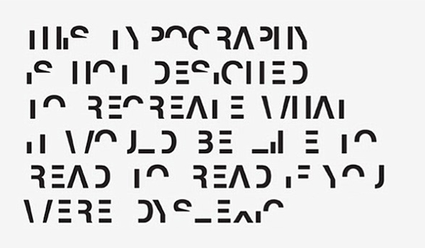
We all know that certain fonts can cause emotional reactions (yes i’m talking about comic sans) but can they be designed to recreate the feelings of frustration of being dyslexic?
Final year design student Daniel Britton who himself is dyslexic, set himself the task of trying to demonstrate to his friends and teachers what it felt like. He created a font which removes half of each letter, overall it isn’t meant to recreate the experience, its only intended to show the reader what it feels like, the extra difficulty and effort that is required and often the frustration that follows as it halts your reading experience.
Obviously there has been other designers who have tried to get the effects of dyslexia across through various methods of art such as Sam Barclay. But overall, the aim hasn’t been to recreate what it actually feels like, merely to evoke the feelings of those who live with it every day.

After Spotify refreshed its identity a few months ago to give itself a bold ‘Music brand’ appearance, where it ditched its previously sedated colour palette in favour of a look that complimented its lively music culture, iOS users last week were greeted to a little update.
In all fairness it’s a barely noticeable update, a change in colour tint. Though that didn’t stop people complaining.
Ultimately its a continuing roll out of the updated brand which received positive reviews when launched, its an example of people not taking the whole brand in context or seeing the update but not realising why its changed and instead only choosing to see a more vibrant shade of green bordering on gerish colour appearing on their iPhone.
How do you create an identity for an 800 year old church without running the risk of alienating your current audience, but at the same time needing to attract a new one?
University Church was founded in the 13th century, when it was used to host religious services and academic lectures by students and teachers at the University of Oxford. It still hosts Christian services and non-religious events, such as talks, poetry readings and concerts.
Since launching early this year, Spy Studio’s branding for Oxford’s University Church has had a positive response from both newcomers and loyal visitors. A more contemporary identity that would appeal to tourists, students and passers-by as well as the congregation, was created and reflected the church’s liberal outlook as well as its past.
The introduction of a new word mark which features a slanted device was also used, which can be used across and under images and as a placeholder. The device is a reference to light (the University of Oxford’s motto is ‘The Lord is my light’) and the church’s desire to “provoke and illuminate.”
Overall the rebrand captures a vibrancy which will attract a younger audience, whilst managing to avoid something that would be seen as far to conservative by some or held back with tradition by others.