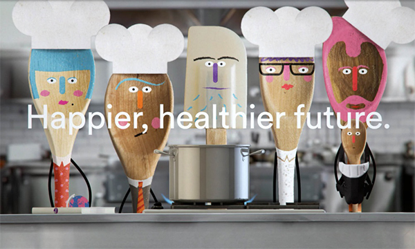
As a creative agency based in Newcastle upon Tyne we like to keep informed of the happenings in the wider design world. Much can happen in one short week – so here’s our roundup of the stories that caught our interest over the past seven days.
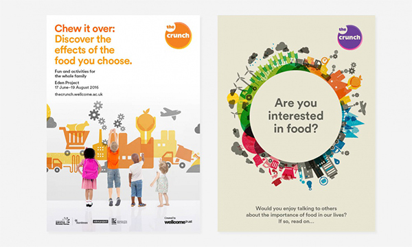
A new public engagement initiative called ‘The Crunch’ to promote food and health in young people was launched by The Wellcome Trust last week.
The initiative has been created to be fun, foody and impactful to make young people think about the need to reconsider their relationships with food and drink with the aim of a more healthy lifestyle. Bold type, Icons, and illustrations using vibrant colours have been used to link topics and provide simple explanations without overload and distorting the key issues.
The Crunch will produce more than 33,000 of these kits which will be distributed to every school and college with the intention to reach 100,000 people by face to face and digital communication.
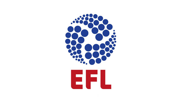 Consisting of the Championship, League One and League Two, the Football League represents three football divisions in England and Wales – a total of 72 clubs.
A new identity for the League has been produced by Futurebrand, to be implemented at the beginning of the 2016/17 season following a process of consultation and development. The league will also be renamed the ‘English Football League’, shortened to the EFL for ease of use (queue an unhappy Wales).
The new logo consists of 72 circles (or balls) in three sections to represent the clubs and the three divisions. Flexibility will be allowed in reproduction, with each team receiving a personalised version of the logo to match the team colours.
The new brand has received a steady flow of unhappy response with fans likening the logo to that of a soap powder, dishwasher tablets and a petrol station. A little harsh we think; aesthetically the neater proportions certainly bring the brand up to date with the EFL hoping to appeal to a new, younger generation of fans.
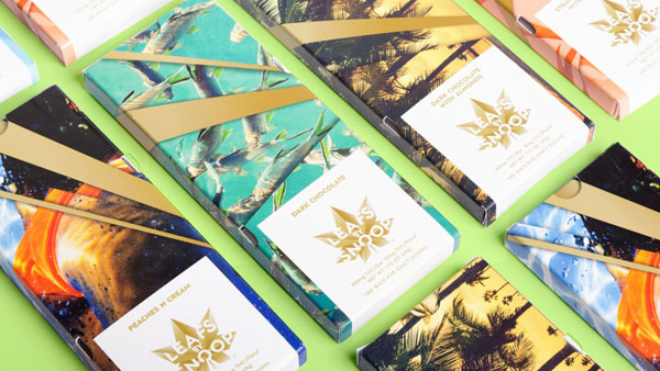
A number of US states have entirely legalised the use of marijuana recently, creating an opportunity for one of its biggest fans, Snoop Dogg to release a range of products; Pentagram took on the task of building a look for the range.
‘Leafs By Snoop’ has been designed to appeal to both recreational and medical users; an angular gold cannabis leaf gives a sophisticated look to the logo, with fractured lettering and ‘California cool’ imagery such as palm trees and blue skies creating colourful, eye catching packaging.
The range includes sweets and chocolates, named ‘gummies, drops and chews’ due to restrictions in calling items ‘candy’ and care had to be taken to ensure the packaging is child proof.