As a creative agency based in Newcastle we always keep an eye on what is happening in the wider design world. Lots can happen in just one short week, so grab that first coffee of the morning, and read the stories that caught our attention over the last seven days.
We all know from the news and tv that the NHS constantly gets its resources squeezed and tested to the maximum.
With A&E departments no different and the need to cut waiting times, Manchester City Council’s in-house design team have created a campaign encouraging people not to use A&E departments. By omitting the letters “A” and “E” from a series of minor ailments. The campaign which is rolling out across the Manchester area includes phrases such as “sor_ thro_ts don’t need A&E” and “Influ_nz_ doesn’t need A&E”.
The awareness campaign has also been designed for touchhpoints including outdoor ads at bus stops and on busses as well as t-shirts and tissue box packaging, with the over all aim of getting people to think twice and use the pharmacy first for day-to-day healthcare, instead of clogging waiting rooms at A&E.As always these type of campaigns do generally work to an extent, its well executed, it makes you think and question if you are at fault yourself.
But over all that niche of people who still persist on going to A&E for every sort of minor ailment will sadly never change.
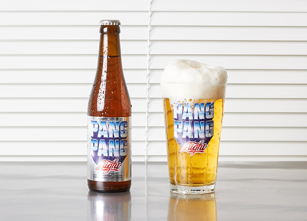
No they aren’t our words for this story, but the words that Swedish Craft Beer Manufacturer ‘Pang Pang’ gave to its appointed design firm.
The company chose those words with the purpose to highlight the processes of big, commercial breweries by intentionally making a “cheap, adjunct” beer that was as “boring and bland as possible”.
It seems strange that a manufacturer would deliberately want to brand a product in this way, but in doing so they have ended up with a product that has its own unique identity amongst a plethora of generic Craft Beer Companies that are springing up all over the world.
An identity which seems to be inspired by US brands of the 1980s, the use of over the top chrome metallic typography, bold colours, and lastly a “wink to bigger drinks brands” with the inclusion of the word “Light”. (Think Jean Claude Van Damme).
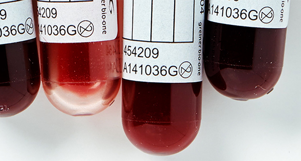
To help launch the ‘Questioning the Bomb’ exhibition at the Art Gallery of Maryland, Pentagram’s Harry Pearce created a thought provoking poster to mark 70 years since the twin bombing of Hiroshima and Nagasaki in 1945.
According to Pearce, inspiration was taken from when he was working on a totally different project in which he held a photo of ink drops underwater upside down and saw the mushroom cloud. Pearce says, “I felt compelled to use my own blood dropped into water, coupled with the line, ‘Its all our blood’ in answer to the exhibition’s title—Questioning the Bomb.”
The photograph is set on a white background with grey and black type marking the locations and times that the atomic bombs were dropped, the stark outcome is a piece of work which shows what we as humans are capable of; and what we could still do to others.
The final result was a meticulously planned shoot with experimentations using ink, water temperatures, drop heights and real human blood.