As a graphic design studio in Newcastle we always take note of what’s happening in the wider design world. Lots can happen in just one short week so here’s a quick roundup of some of the bigger stories we’ve followed from the past seven days.

2017 will mark Canada’s 150th birthday. Last week the Canadian Government unveiled their new logo to commemorate the occasion, a stylised maple leaf made of multi-coloured diamonds designed by 19 year old student Ariana Cuvin. But the road to this final logo design has not been smooth or easy.
Initially, the Government commissioned Canadian Heritage to design a set of logos in-house which were then distributed to focus groups for feedback and approval. The reaction was decidedly luke warm and once the logos found their way into the open, the feedback from the design community was damning.
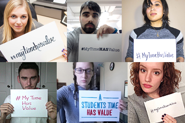
So last year, in a change of tack, the Canadian Government launched a nationwide contest aimed at design students. The hope was to attract a raft of logo ideas with a $5000 prize, as well as national exposure for the winner during the year of celebrations. But again, things didn’t go according to plan when those same students set up a protest campaign decrying the Government’s attempts to effectively get design work for free. The campaign, which relied heavily on social media pressure with the hashtag #MyTimeHasValue, gained a significant amount of attention and press coverage. This was bolstered by the vociferous condemnation of the logo contest from The Graphic Designers of Canada organisation who attacked the Government for taking a ‘spec work’ route in commissioning design work for such an important national event. This was in itself, a parallel to the country’s 100th birthday in 1967 when a similar logo contest was set up (although aimed at the broader public rather than design students). Then, the results were so underwhelming that the Government eventually gave in and sought the services of a design studio, with much better results.
This time, the Government hasn’t backed down from the contest and have finally found themselves a winner. With such strong public sentiments aired over the manner in which the Government have handled the process, it will be interesting to see how the design community in Canada react to the final symbol in the coming weeks and how the logo will be rolled out during the celebrations.
From one student protest to another. In this case, it’s the now common situation of a student and alumni revolt against a university’s attempts at rebranding. With the increase in social media over the last decade, leading to an increased sense of empowerment from users in venting their opinions, education establishments have suffered serious public scrutiny when launching new visual identities. The universities of Waterloo and California received particularly vehement backlashes.
Now it’s the turn of the University of Loughborough who unveiled their new logo last week. This new version replaces the last iteration that was introduced in 1996. That logo was itself unpopular but was introduced before the current trend of online protesting had found such a powerful foothold. It does make an interesting statement about why such protests arise – if the previous logo was unpopular among the students when it was introduced, why is it now so accepted and why is its replacement again met with such outrage?
In fairness, the old logo was more inkeeping with the traditions of a higher education body (by maintaining a shield graphic from its predecessor) whilst also being simple enough to work across different media and varying sizes. Some work was necessary on the typography but otherwise a minor update may have been enough. The university thought otherwise and commissioned a full rebrand citing a lack of brand cohesion and consistency with the old logo. The new logo is not terrible but doesn’t have any truly unique indicators or relationship to the university. It could be for anything from a pharmaceuticals company to a toy manufacturer. The online backlash has included the usual staples of ‘drawn by a six-year-old’ or ‘I could have done that on the toilet’ which points more at the tendency for uncritical knee-jerk reaction rather than genuine reasoned criticism. That said, launching new branding for any university or college is a precarious project these days and in this case, it would seem that Loughborough have slightly missed the mark.
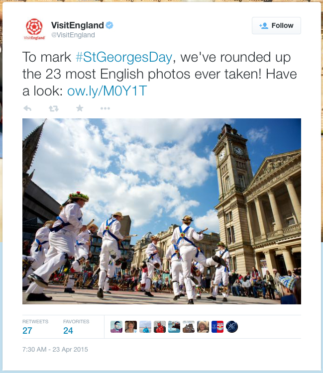
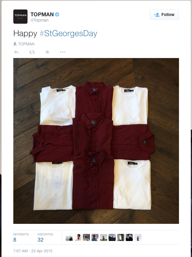
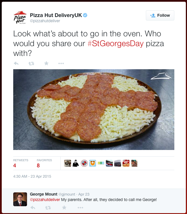
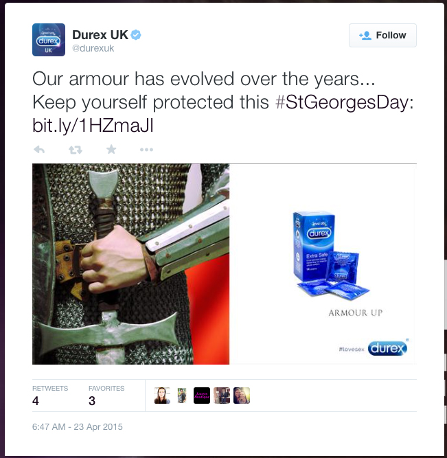
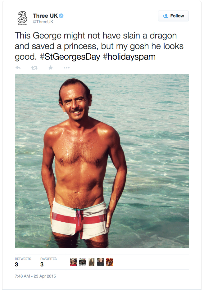
It may not have the hefty national pride of St. Andrew’s Day, or the global, hedonisitic appeal of St. Patrick’s Day, but thanks to social media, St George’s Day made a strong appearance this week. In fairness, any calendar-based cause – from commemorating national saints to World Pretzel Day (which was yesterday by the way) – is an excuse for hashtags and trending. And brands have cottoned on to this and are equally opportunistic in exploiting a date’s significance to further their reach. From the perfect tie-in promotions of Visit England to the subtle connotations of Durex, to the funny but barely relevant post from 3 UK. Check out the gallery below for some of Twitter’s St George’s Day brand highlights:
 |
 |
 |
|---|---|---|
 |
 |
 |