As a graphic design studio in Newcastle we always take note of what’s happening in the wider design world. Lots can happen in one week so here’s a quick roundup of some of the bigger stories we’ve followed from the past seven days.
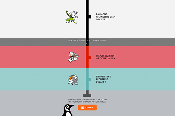
Last week Penguin launched a website solely for passengers of the London underground.
Through the whole month of August, tube passengers using Virgin WiFi can read exclusive excerpts from novels, as well as interviews from the authors as well as other audio content which is all part of a campaign to help celebrate its 80th birthday. The website has been designed in-house by Penguin’s design team and it has a similar feel to one website Penguin published earlier in the year to promote their little black classic series.
There are some nice touches which flow through the website to tie everything together, such as the colours which reference the multitude of different Tube lines and stylised icons to accompany each extract from a story, whilst still retaining a minimal feel similar to their other pop up sites.
The over all idea of shorts and extracts that users can take advantage of whilst been cramped up next to someone seems ideal, mainly for the fact that there will be no awkward glances when someone has nothing to look at, but also for that slight moment when they get lost trailing through a website that keeps your attention.
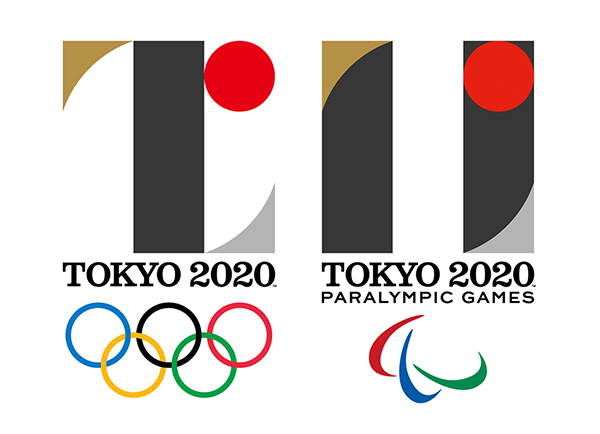 The Tokyo 2020 Organising Committee unveiled the logos for their Olympic Games in 2020 this week.
Normally when Olympic logos are unveiled there seems to be a sense of impending doom and mockery from the public, (if the london 2012 design was anything to go by). But the identity of these logos seem to be strong with purpose and remain key to the aim of reflecting the Games’ vision of “the full meaning of coming together as one”.
The logos make clever use of negative space to make each logo work and play off one another, whilst only using four elements: a black column, red circle and gold and silver curves. Keeping the elements to a minimum has helped create a stronger identity but the shapes that were used have shown this was clearly thought out and planned. The Paralympics logo is inspired by the universal sign of equality whilst, the colour of red circle is intended to show power and a world of unity.
Gradually we will see how these logos will be rolled out on further branding materials and signage, but as a starting point they seem a lot stronger than our attempt in 2012.
Now time to wait and see what the mascot looks like…
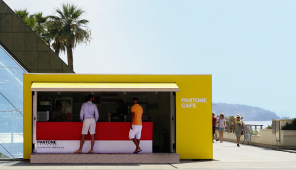
Last but not least Pantone charts and swatches, they are a key part of any designers kit, found hidden under sheets of lose paper and cups of coffee, but we now have crazy color-coded establishment to check out and possibly obsess about.
Located in Monaco, the newly-opened PANTONE café boasts a colourful and vivid colour scheme hailing directly from the colour swatches themselves. A vast amount of food is on the menu from sandwiches, salads, snacks to juices and soft drinks, all revolving around the tagline “Taste the Colours”. The colour coordination doesn’t just apply to the food and beverages though; everything in the café from the tables, chairs, napkins, and coffeemaker all correspond to Pantone colour codes.
So how about munching on a ‘Tomato Red Mozza White #18-1660 Sandwich’ or sipping on ‘Vibrant Orange #16-1364 Juice’? Best hurry and visit the cafe though, because as its a pop-up it will become no more on the 9th September, 2015.