As a design led brand agency based in the Newcastle we always take note of what’s happening in the world of design. A lot can happen in just one short week so here’s a quick roundup of some of the stories we’ve followed from the past seven days.

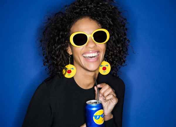
Pepsi is gearing up for a fun summer campaign in the UK which will see emoji’s featuring on its bottles and cans across the companies range of drinks. PepsiCo Design & Innovation Center came up with hundreds of PepsiMoji designs which have been tailored to different countries markets and all feature the Pepsi circle as well as blue, red and white brand colouring.
The Pepsi campaign follows in the footsteps of Coca Cola’s ‘Share a Coke’ personalised name bottles which proved a huge success for the rival soft drink business. An app has also been created with Pepsi hoping the emoji branded drinks will engage customers and prompt them to share emotions with each other.

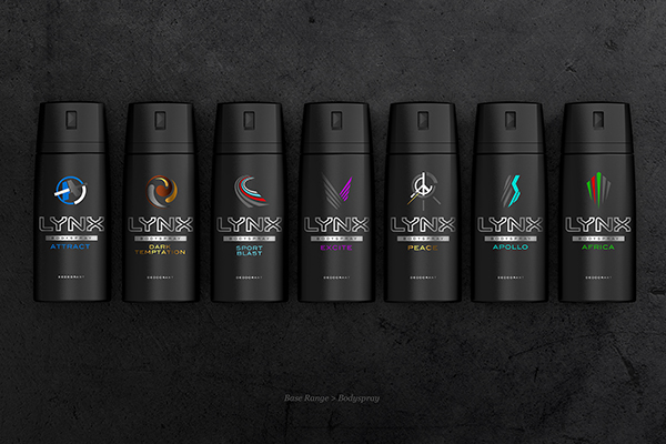
This week Lynx announced plans of a major roll out of its new progressive rebrand. Its first since 2014, aimed at showing off the masculinity and attractiveness of the brand.
The new branding has been stripped back removing any overly expressive graphics and letting the brand ‘own black again’ reverting back to a slightly more minimalist approach.With the rebrand comes a range of new icons which are now all consistent to further strengthen the updated identity; and the addition of a higher positioned premium range consisting of Urban, Streetwise and Adrenaline.
It will be interesting to see whether the push to a more upmarket range will take hold, especially when it will be going head to head with brands that have already cemented their position in that category.

With the many April Fools pranks that were flying around today its sometimes hard to work out which ones are real and which ones are fake.
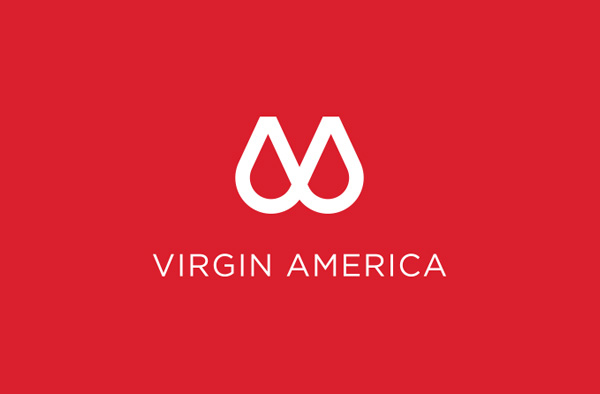
It turns out that Virgin Airlines sent out a press release giving us an update on their apparent new logo. In a press release that landed the airline revealed it had ditched its iconic red scribble logo in favour of, well, whatever this new logo looks like…
Though the reasoning behind the parody logo seems to be slightly too precise, as its been described as ‘two prominently displayed half circles represent both our tech-forward innovation on the one hand – and our supportive approach to guest care on the other. By connecting the two half circles, we’re making it clear that they are inextricably linked.’ I guess they had to make it believable, right?