As a creative agency based in Newcastle we always keep an eye on what is happening in the wider design world. Lots can happen in just one short week, so grab that first coffee of the morning, and read the stories that caught our attention over the last seven days.
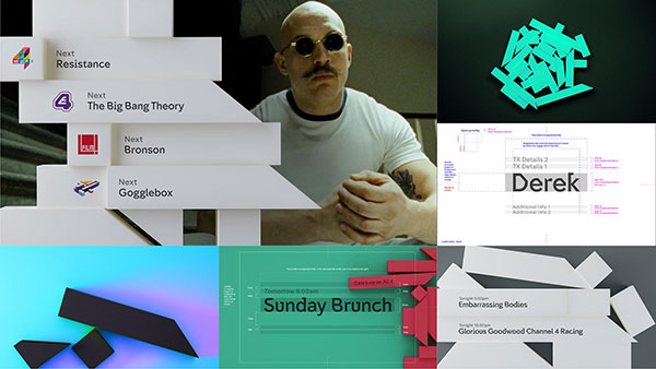 Channel 4 has gone all edgy with a major rebrand released last week which sees a deconstruction of the original 1982 ’4’ logo; broken apart and used abstractly in a new set of idents, on-screen menus and supporting graphics.
The new look is based on the original ‘4’ logo broken down into its constituent parts to create abstract visuals which are meant to portray the channel as “diverse, challenging and innovative”.
A Jeckyl and Hyde set of two new typefaces, created by design legend Neville Brody have also been introduced; including the business like and professional ‘Chadwick’ for use on the likes of sport and news programmes and it’s alter ego ‘Horseferry’ to give an unpredictable feel to more challenging content.
For the main corporate identity the channel has adopted the existing All 4 logo which was released last year.
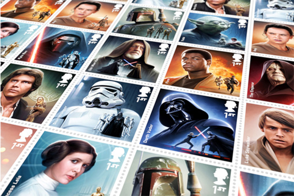
With the launch of Star Wars Episode 7 in the not so distant future, promotional materials, toys and other merchandise has been launched with warp speed pace.
Last week The Royal Mail and illustrator Malcolm Tween unveiled their limited edition set of 12 collectors stamps to celebrate its release this year and to also look back on the seminal film franchise.
The stamps themselves immortalise nine iconic characters from the films with the inclusion of some new not so familiar faces to the series. Having been involved in previous Star Wars projects Tween was tasked with capturing multiple elements into the stamps such as additional second scenes and also the Star Wars typeface we all know.
The creation of the set was a long process with multiple character versions and varied combinations been tried before Tween came on board. As most of the reference shots were either low resolution or blurry many of them had to be recreated from scratch before final artwork could be started. The technical detail in the illustrations are fantastic, which comes at no surprise when you realise that the artwork was done at 1000% compared to the finished stamp size.
The end result is a set of illustrations that work together and also individually. They capture the tone of the films with individual colour sets and will no doubt become collectable my Star Wars fanatics, they are released on 20th October.
Two years in the making and thousands of design considerations, across multiple design firms has resulted in a ‘revolutionary’ new brand for Best Western (according to Chief Executive Rob Payne). And in a way it is revolutionary for the hotel chain, but only because it is a step away from a very tired and dated brand which has been crying out for change since it’s last update 22 years ago. But in terms of pushing the boundary’s and standing out from the crowd it’s no Che Guevara and is it just us or does the new brand typeface seem more Middle Eastern in feel than Western?
The company which is home to the largest group of independently and family-run hotels in the UK; over 275 in various locations has also added 3 new sub-brands to it’s collection; ‘BW Premier Collection’ (5 star hotels), ‘ViB’ (urban concept hotels) and ‘GLo’ (boutique hotels).
It’s good that the company has made the step to reinvent itself after such a long period of standstill but we can’t help feel design by committee has resulted in an identity which is lacklustre and safe – it could have been so much more appealing.