As a graphic design studio in Newcastle we always take note of what’s happening in the wider design world. Lots can happen in one week so here’s a quick roundup of some of the bigger stories we’ve followed from the past seven days.

Last week Mini decided to quietly introduce a more stripped back identity which is aimed at “focusing on the essential”. The logo removes all shading and detailing from the previous, going back to a minimal black and white logo. This coupled with the introduction of new typography and two dimensional imagery on new advertisements have been designed to emit the basic idea of clarity and authenticity, which was the original idea behind the MINI car design according to brand owner BMW.
The rebrand rolls out as the brand unveiled its new MINI Clubman car design, in an attempt to realign the MINI brand’s product and brand strategies. Overall the stripped back clean approach coupled with the tongue in cheek humour MINI is famous for still features heavily on its adverts and commercials continues to have legs and entertains.
The old saying of ‘if its not broke don’t fix it’ can no doubt be applied to MINI, they just tweak it occasionally to keep it relevant and appealing to its commercial markets and fan base.

Facebook has yet again updated its logo subtly but distinctly.
The idea that this change comes at a time when Facebook are striving to appear “more friendly and thus this change reflects the path that they wish to take”. Visitors of the social media platform will be familiar to the rolling out of the new logo designs, but this is actually the first time since 2004 since an update has occurred, when they launched their own custom font ‘Thefacebook’.
The old logo strived to look grown up and to be taken seriously, as the company was just starting. But i cant help but feel that the logo is slowly becoming generic and lacking character, and it becomes another time that a potential opportunity to further look at the brand has been missed.
Only time will tell how long this version will last, before the slow introduction to minuscule changes start top appear.
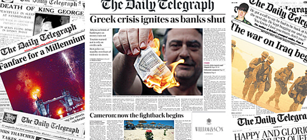
The Daily Telegraph unveiled a redesign of its printed publication, which sees the newspaper’s original Gothic masthead font restored.
The newspaper’s in-house design team has completed the refresh. It comes as The Daily Telegraph celebrates its 160th birthday, and is intended to make it “smarter, more readable and just a little brighter,” says the newspaper’s editor Chris Evans.
The new masthead was implemented when the paper was set up in 1855, and was used for 148 years before eventually being replaced. As well as the masthead there has also been the introduction of new body text typefaces and other sections such as the sports pages have also been redesigned to make the whole publication cleaner and clearer, with the overall aim that it will make the daily paper a better read for people.