As a Brand Communications Agency in Newcastle we always take note of what’s happening in the wider design world. Lots can happen in just one short week so here’s a quick roundup of some of the bigger stories we’ve followed from the past seven days.
So if your a fan of football, you’ll know about the Champions league and also its poor brother The Europa League. One is seen as the holy grail of european football whilst the other regularly gets shunned by many.
Its not really surprising that UEFA last week announced a major rebrand that would last three years (to keep the brand fresh by constant change, or an excuse to ditch a failed attempt?). The identity is inspired by the strong connection between players and fans, who together in club and community, experience the vast diversity and emotion of the UEFA Europa League, the end result is an energy wave that radiates from the trophy consuming people.
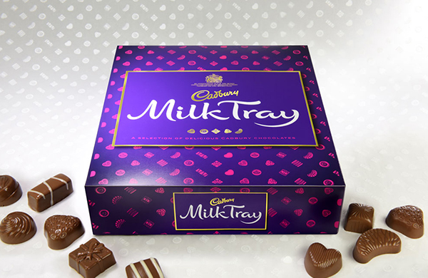
Cadbury’s last week unveiled its new packaging for the much loved Milk Tray, the reasoning behind this rebrand, well to try and realign it as a special gift and not a last minute dash to the shops for a panic bought box of chocolates.
The consultancy responsible for the rebrand; Design Bridge says that the design is to re-establish the product as being a ‘special gift choice’ with the new design, and to change more recent public perceptions of the product itself.
The introduction of new hallmark illustrations based on the five most icon chocolates sets a standard by giving the sweets a precious quality. Coupled with a fashion inspired pattern much seen on high end wrapping paper which wraps the cover of the box, reaffirms the desire to push the beloved Milk Tray into new more upmarket territory.
Obviously only time will tell if myself and others will stop rushing into a supermarket to pick up a box for a last minute treat, or as a panic buy for a gift for someone.
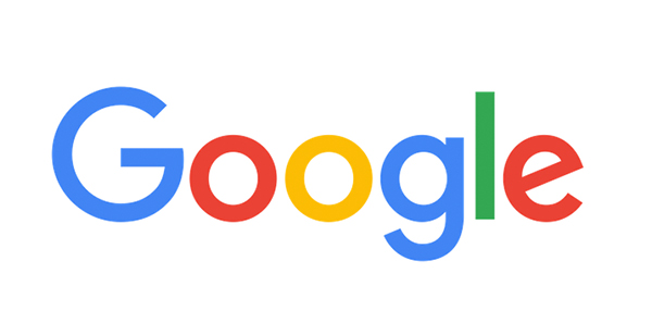
So Google last week launched its new logo, we all noticed right?
The new identity which has been been worked on by their own in-house design team isn’t groundbreaking, nor does it need to be. It’s the system and cohesive thinking about it that stands out and may be hard to get excited about for the general public. They have stripped away the custom serif logo which has stood the test of time for the last 16 years, brushing it under the carpet. Replacing it with a fresh, playful custom san serif typeface, whilst retaining the original colour sequence we all know.
Googles design team say that the new logo “maintains the multi-colored playfulness and rotated ‘e’ of our previous mark—a reminder that we’ll always be a bit unconventional”.
Its not a coincidence that the appearance of a new logo, comes at a time where Google’s parent company recently rebranded; calling themselves ‘alphabet’ and with that in tow, the base branding has been rolled out to our beloved search engine.
Its been rolled out in a way which works. It wasn’t rushed, it retains a quirky, friendly feel which google are known for, and it feels like an evolution of themselves not a revolution some brands end up achieving trying to reinvent themselves.