As a design studio based in Newcastle upon Tyne we always keep an eye on what’s happening in the world of design. A lot can happen in a week, here are just a few of the stories that caught our eye recently.
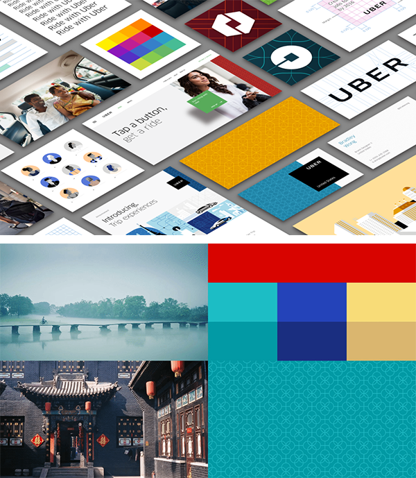
The largest taxi firm in the world who own no taxis this week unveiled their new global rebrand which has been launched to reflect Uber’s technology as well as the cities it serves.
Its been 5 years since the last logo was rolled out and the reworked logotype has been designed with the aim of being more grounded and reflect on the maturity of the company as a whole. The stripped back logotype will be joined by ‘the atom’ which is a bespoke pattern and vibrant colour scheme native for each city Uber serves. Currently only a few cities have the scheme in place, but the bigger goal in the future is for Uber to have hundreds of unique designs, one for each city.
The in-house team who are responsible for such an idea spent months researching textiles, scenery, fashion, art and architecture to create authentic identities and the results look great. Moving it away from the mundane magnet logotype it once was.
Whilst this may seem highly ambitious, you don’t start a company in 2009 to eventually become one of the largest taxi firms in the world in such a short space of time without that ambition.
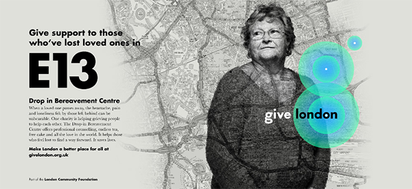
New London based charity ‘Give London’ has launched their new logo this week. The charity which looks to give support to people by raising money for multiple local charities, has been working on their new brand along side design studio The Allotment to create a fresh emotional identity.
The new logo integrates a geolocation device, which when viewed online pulsates creating an abstract G, the overall aim is for additional locations to come online and their postcodes would also appear as a pulsating beacon. This would eventually show multiple beckons where people have donated to visualise the impact that Londoners have towards local charities in need.
The overall aim of the design was to create a strong emotional connection with the charity and the people it helps, whilst enabling it to become a powerful force for good within London.