Many sans serif fonts take a similar approach in their basic design – uniform line weight, constant ascenders and descenders, simplicity, clarity and refined shaping. In the case of Helvetica, and many other Swiss-style typefaces, there is also a specific intention towards neutrality.
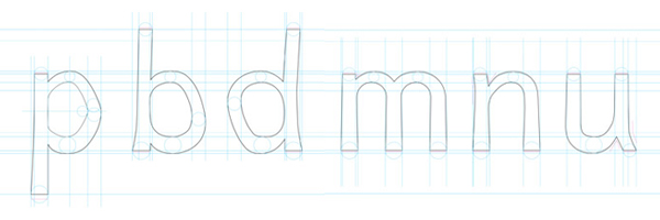
But Helvetica – and similar tight-spaced, uniform-shaped fonts – pose a particular problem for people with dyslexia. Because many of the letterforms are reversed or rotated versions of other letters – b and d, p and q, u and n – this can cause confusion and difficultly in recognition for dyslexics who unconsciously switch or mirror the letters in their minds. The uniformity and neutrality of Swiss-style typefaces exacerbates the problem.
Which is why Dutch designer Christian Boer set about crafting a new font that would address these issues and make it easier for the 10% of the world population who live with dyslexia. The result is the Dyslexie typeface. It deals with the inherent issues in sans serif fonts in many ways – some obvious, some more subtle. The clearest indication is in the thickened line weight at the bottom of the letters and the deformation of the rounded characters. Having the letters heavier at their base helps to ‘ground’ them, giving an obvious top and bottom to counteract their possible rotation. The deformed b, d and p help ensure that they can’t be mistaken when mirrored. More subtle alterations include slight italics on certain letters; varying apexes on v, w and y as well as increased x-axis height on all letters to improve differentiation. The letters are more spaced and the capitals and punctuation marks are bolder to help recognition of the start and end of sentences.
Clearly Boer’s aim was not to create a font with mainstream aesthetic values – Dyslexie is necessarily asymmetric and unbalanced. But the result is nevertheless a surprisingly charismatic font. Whilst it lacks the apparent refinement of the typefaces it would replace, it does gain a quirky appeal in its earnest ambitions. Boer claims that the typeface helps people with dyslexia to read faster and with fewer errors. It is available to download for free and has apparently been taken up by companies such as Shell, Pixar and Nintendo as well as a number of universities and educational institutions.
Other fonts created for dyslexic readers are available including the Open Source free font, OpenDyslexia, which uses similar techniques as Dyslexie to aid readability. Whether such fonts will ever be appropriated for mainstream use or as an option in a computer OS remains to be seen. For now, Dyslexie is on display as part of the 2nd Istanbul Design Biennial until the end of this week.