The last 10 or 15 years have been particularly difficult for the long-standing fast-food chains. No-one has ever made a case for McDonalds being good for you and the fast food chain and its rivals have maintained popularity despite the poor nutrition of their products. But the increasing cultural desire for healthy eating has meant that even the granddaddy of burger joints has had to do some updating and remarketing since the turn of the century. McDonalds now offers salads and juices as well as fruit pots and vegetable sticks in its kids meals. And they’ve also done some radical overhauling of their restaurants, scrapping the shiny plastic chairs and cheap melamine counters in favour of dark wood walls, leather seating and tinted glass panels. All to ease the guilt of their calorie-counting patrons.
Now, KFC has joined in with new interior designs being outfitted in their Bracknell, Exeter and Reading restaurants. However, where McDonalds have opted for a straight update – changing materials and furniture but staying true to their essential ‘fast-food-ness’ – KFC have chosen an even more drastic revamp. Whilst nothing has changed with their logo, this move seems to be a real attempt at changing their identity, distancing themselves from their fast food counterparts and aligning themselves more with Nando’s style eateries. The painted brick walls, heavy wood-block counters, low-hanging bronze lamps and ‘artisan clutter’ decor are less fast-food joint and more home-cooked family kitchen. Even the food preparation areas are more open plan so customers can see their meals being made. It’s a conceit that works brilliantly in a Jamie Oliver gourmet restaurant but do you really want to see the kitchen staff microwaving your Zinger Tower Burger?
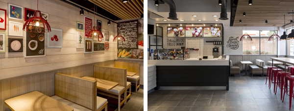
The new layouts, designed in-house with aid from R&R Consultancy and Finch Interiors, are actually surprisingly stylish and welcoming. Based on the idea of families coming together to share meals, the new aesthetic is a world away from the red leather and plastic outlets still currently in play in the rest of the country. And the idea of building an interior identity around sharing is not just a brand gimmick – KFC has always based a large part of their menu around meals to share, from boxes and platters to bargain buckets (and as far as I’m aware, KFC is the only fast-food chain to offer a full Vienetta as part of their meal deals). Not so relevant are the arty, hand-written slogans about the food being fresh and prepared daily. Which fast food chain doesn’t prepare its food daily? There is an attempt to piggyback on the growing social appetite for a return to basics – fresh food and a minimum of ingredients. It’s a tough sell for a fast food chain to claim freshness and basic ingredients no matter how smartly designed the restaurant layout.
Since the demise of Wimpy, KFC has been my favourite of the big three fast food joints and when these new interiors are rolled out nationwide next year they may even entice me to visit my local more often and even sit in the restaurant to eat. But I wonder whether this is a company pushing too hard to be something other than what it is. People like fast food outlets in spite of their unhealthy food – having the joint decked out like a restaurant that serves ‘proper’ meals could potentially cause problems for some diners. That said, KFC has been on a financial slide for a number of years now and this new look does seem to have the potential to help turn that around.