Courage is a rare commodity when it comes to big brand advertising. In this arena, perhaps the height of bravery is to create an advert that purposefully excludes your logo. Even major companies like Apple or Nike utilise their brandmarks every time they advertise despite their broader identity and brand language being strong enough to work without them.
So we have to tip our hat to KitKat for their latest, creative billboard design that not only leaves off their logo, but also amputates a chunk of their tagline. It is courageous indeed to rely solely on a brand colour and a typeface, especially when that colour is a middle-of-the-road red and the typeface is a standard sans serif. The idea in itself is fun and nicely executed but it would have been so easy for the company to drop their logo into the bottom left corner, just to make sure the idea got across. But it works so much better without the logo and connects more with the viewer as they recognise the message minus the main brand indicator. If anything, the lack of the logo strengthens the message.
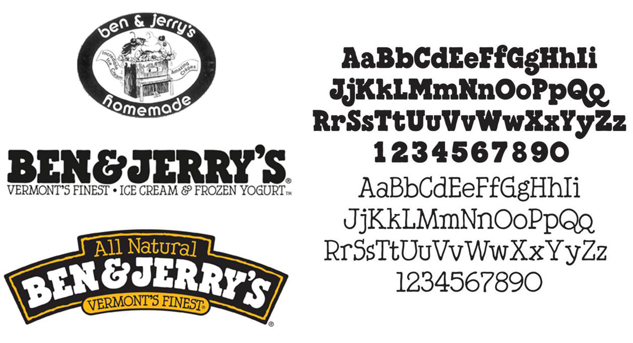
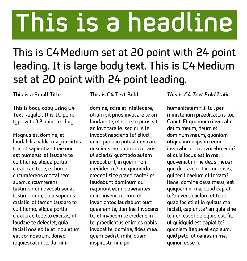
What is particularly interesting to note is how easy it is to quickly connect the brand to the advert. KitKat is not a powerhouse tech or automotive brand; it will never feature on Interbrand’s Top 100 list. It is a chocolate biscuit. And as mentioned above, the brand elements minus the logo are not particularly unique or striking. There is no idiosyncratic pairing of colours as there are with Ikea, Pepsi or UPS; just red and white. Nor is there a differentiating typeface such as Ben & Jerry’s ‘Severence’ or Channel 4’s ‘C4’. Just Franklin Gothic, bold and italic. Yet despite all that, the setup is still instantly recognisable as a Kit Kat advert. In the absence of a logo, why do we not connect this ad to Coca-Cola or Vodafone or HSBC who all use the same brand colours?
Part of the reason must be consistency. There is an ethos at play here, a singular message from KitKat that has been continually distributed for decades. “Have a break, have a KitKat” was first used in the product’s initial televised commercial in 1958 and has been used ever since. The advertising strategy has been consistently based around the ‘take a break’ premise, reaching a cultural highpoint in the late 1980s with the roller-skating panda bears advert. And since the end of the Second World War, the product has always used the white and red wrapping. This consistency of message and colour is what allows the brand to advertise successfully in the absence of its primary trademark. On the whole, it appears that the brand’s message is more significant than its logo.
This advert looks at first glance like just another fun take on the company’s usual product message. But it speaks of a strong brand identity and a company that is confident in the power of its product’s brand to communicate even when stripped back to its most bare essentials. Having such a consistent, strong brand language permits a certain amount of freedom in marketing that enables the use of this kind of advert. It engenders flexibility and experimentation, allowing the creation of advertising that isn’t dependent on the use of a trademark.
Most of all, it is a very direct illustration of the maxim that your brand is about more than just your logo.