Newsround has been around forever. I still remember the programme from my childhood when John Craven was the front man and I suffered through watching it between Cheggers Plays Pop and Blue Peter. It is unrecognisable now from those early days of children’s television. Today it is young and vibrant and manages to hook into all the elements that interest school kids – celebrities, music, tech, social networking – whilst still delivering news content to help educate as well as entertain.
Earlier this month a revitalised identity for the long-running show was unveiled. Created by in-house designer James Mobbs, the rebrand includes new titles (and a new theme by composer David Lowe), stings, on-screen graphics, video walls, print collateral and set design. The most obvious change has been with the titles which have been designed to bring the show more inline with the main BBC news branding albeit with a looser dynamic and more energetic feel. The colour pallette is necessarily broader than the standard deep reds, white and black of BBC News but is also a welcome change from the brash toxic green and purple of the previous identity. The core colours – teal, blue and purple – coupled with accent colours of orange and pink, give the identity a youthful aesthetic without being childish whilst the new brand typeface – Neo Tech – is distinctive without being ‘wacky’ and grown-up without being ‘stuffy’.
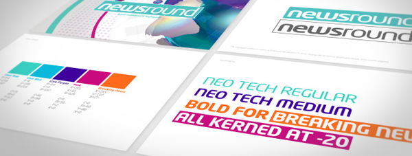
Newsround Brand Guidelines
I’m not sure how early-80s-era John Craven would have responded but for a current affairs show for older children and young adults the new identity is perfectly pitched – vibrant and youthful whilst also acting as an important bridge to the BBC’s main news programmes.