No, it’s not an ACDC or Amy Winehouse song track; more important than that, it’s a re-brand! Hot on the heels of the news that Coca-Cola has overhauled their drinks brand (featured in our Friday Round Up on 6th March), British soft drink manufacturer Britvic has now followed suit in unveiling its latest rebrand for their boisterous soft drink Tango.
The redesign created by Brandhouse aims at ‘growing up’ the brand and re-engaging itself with young adults. Gone are the days of the 1990s and 2000s with Tango trying to persuade young teenagers – such as myself – on school lunch breaks to part with their spare change for a sugary rush. This redesign now has to try and do battle with adults who are more used to the vivid orange cans of Fanta and real fruit drinks.
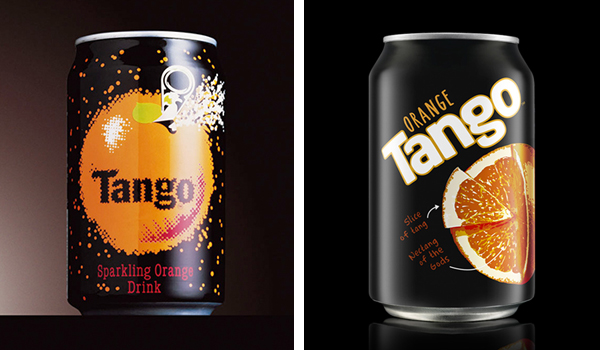
To help this, the new packaging remains black (much like the original) but with the introduction of the ‘science’ of the Anatomy of Tang – a quirky visual dissection of fruit anatomy by identifying where the ‘tang’ originates. Limited by the crude printing process available on drinks cans, Brandhouse had to get its idea across whilst being held back by the restraints of only being able to use 6-8 colours.
The overall outcome has resulted in a redesign that at first glance is more mature, with a more friendly logo now in use, whilst retaining the playfulness left over from its predecessor. It’s hoped this will increase the awareness of the brand whilst also making itself stand out on-shelf next to its main rivals.