As a graphic design studio in Newcastle we always take note of what’s happening in the wider design world. Over the last three months we’ve posted our Friday Roundups, weekly collections of some of the bigger stories we’ve followed from the previous seven days.
To celebrate the dawn of 2015, we’ve put together a retrospective of last year featuring some of our favourite Roundup posts and a couple of the bigger events that we didn’t cover. So, in no particular order, here’s our top ten list of brand and design-related stories from 2014. Here’s to the next twelve months:
(from Friday Roundup – 24th October 2014)
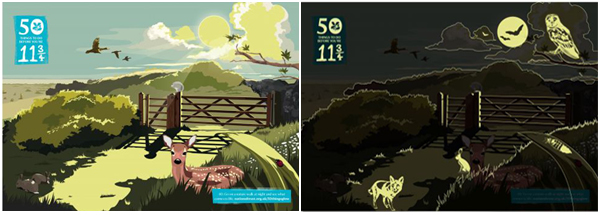
With so much emphasis placed on social media marketing and connecting with an audience online, it is always reassuring to see an organisation using traditional printed mail shots to spread their message. The National Trust used beautifully illustrated postcards with a smart ‘glow-in-the-dark’ print effect to promote their ’50 things to do before you’re 11¾” campaign.
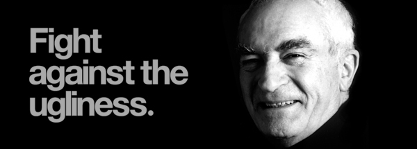
Despite being Italian and having taken on work across Europe, Massimo Vignelli will always be inextricably linked to the US. In the second half of the 2oth Century, his identity work included some of the largest icons of American life – US National Park Service, American Airlines, Bloomingdales, Saks, the New York subway, even Jackie Onassis. He was one of the great legendary designers of the last century whose name was familiar to many outside of design circles – he died in May aged 83. In our Friday Roundup of 17th October, we included a piece on the limited edition book printing of his iconic graphics manual for the NYC Transit Authority.

(from Friday Roundup – 14th November 2014)
Social media promotion is now essential to any company’s marketing strategy. But it doesn’t always go to plan and very often the Twitter-sphere can cause real headaches. Such was the case for Starbucks who excluded the traditional Eggnog Latte from their seasonal menu when it launched in November. Chagrined by the online rage of indignant customers suffering meltdowns from lack of eggnog-infused coffee, Starbucks pulled it back from the brink by acting quickly and reinstating the absent brew.
Sometimes, no matter how much you research, no matter how much time and energy you invest in a rebrand, and in particular a logo, it doesn’t get the public response you expected. AirBnB created a well-considered, attractive, flexible logo and they were clearly proud of it – even going so far as to give it a name; Belo. But it didn’t take too long for the nay-sayers to get online and give the brand a bit of a kicking. Initially derided for being a rip-off of another logo, it was then heavily criticised on Twitter for being illustrative of both male and female body parts. Not great publicity, but perhaps AirBnB’s rather pompous self-satisfaction in their press releases caused some of the derision. Andrew Schapiro, head of AirBnB’s Art Department has since spoken about how the company responded to the social media backlash.
(from Friday Roundup – 31st October 2014)
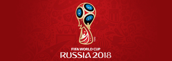
2014 was a big year in branding for large sporting events. Oslo 2022, Baku 2015 and the mascots for Rio 2016 all made an appearance. The logo which made the biggest splash was for the next football World Cup to be held in Russia. The big, glitzy launch of the logo, which was unveiled on the International Space Station before being projected onto the side of the Bolshoi Theatre, did little to stop the online fun-poking. Even after the sarcastic comparisons died down, the logo continued to draw sharp criticism from the Russian design community.
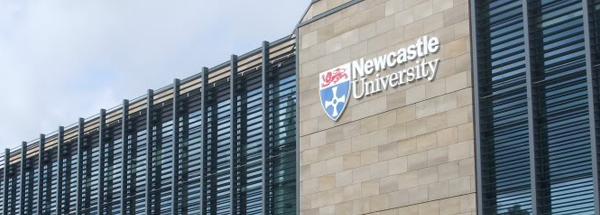
At the end of 2013 there was a furore in the design community when Gentoo Group set about charging £100 for design agencies to tender for their work. Gentoo backed down and removed the charge after complaints from some possible applicants. Despite this, in March of last year Newcastle University applied the same kind of pay-to-tender fee for a new graphic design framework. Although only a nominal fee, there was an even louder outcry to the process with some commentators agreeing that it was a slippery slope and served to exclude many smaller agencies from applying. As with Gentoo, the university changed their minds and axed the fee.
(from Friday Roundup – 10th October 2014)
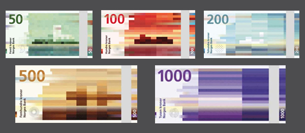
Norway had a design double-whammy in October and November with redesigns of both their passports and their banknotes. The banknotes make our list for being both beautifully designed and also comparatively unique in the pantheon of currency designs. Far from the usual portraits of famous citizens, or straight up landscape images, the designs are original and intelligent, cleverly using the mosaic aesthetic to convey the Beaufort scale increasing with each denomination.
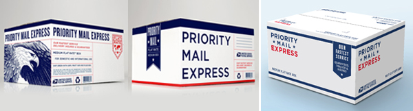
Grand Army's original box design (two left images) and the USPS changed box (right)
In the Summer of 2013, the United States Postal Service unveiled a comprehensive and quite magnificent rebrand. Initially uncredited, in August 2014, GrandArmy included a full project page on their website claiming credit for the work. Most interesting was how the postal boxes as originally designed differed from how they actually looked when launched. The striking eagle images and the dominant, expansive fonts were replaced with blank space and scaled down text – work apparently undertaken for USPS by a third party. The change was generally criticised by design commentators as a weakening of the overall identity created by GrandArmy, but it stands as a useful example of what can happen to elements of a brand rollout once the client takes control.
(from Friday Roundup – 10th October 2014)
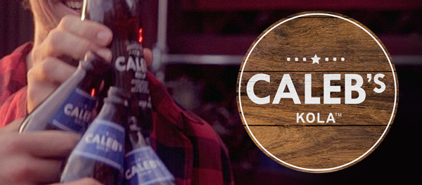
Taking a leaf out of the ‘craft beers’ book, Pepsi launched a new soft drink line in October. Closely aping the simple brand aethestics of many independent ale brewers – quirky name and stripped back logo, bold grotesque typeface, barewood product shot backdrops – Pepsi were clearly looking to forge out a new division in the soft drink market; the grown-up, artisanal cola. Following on the heels of Coca-Cola’s ‘Life’ drink, Pepsi get extra marks for trying something really different and branding it well, a marked contrast to the logo travesty of their core products.
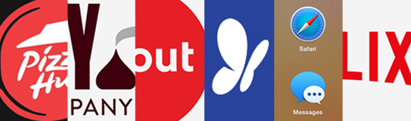
The inexorable rise of ‘flat design’ has been taking place for a couple of years but 2014 saw a glut of revamped, simplified, flattened logos. We covered some of them in a blog post in November. Netflix, Hershey’s and Pizza Hut were among the numerous big brands that embraced the in-vogue design style, some more successfully than others. Even Apple, the great champion of skeuomorphic design since first launching the effects-heavy UI of Mac OS X, finally conceded to the changing tastes of its users and revamped the look and feel of their desktop OS. The flattening is bound to continue in 2015, although Google has taken promising steps towards progressing the aesthetic further with their new Material Design.