For many brands, a new year can be a great time for an identity revamp. But change isn’t necessarily always a good thing, as fashion giant Zara were quick to discover this week…
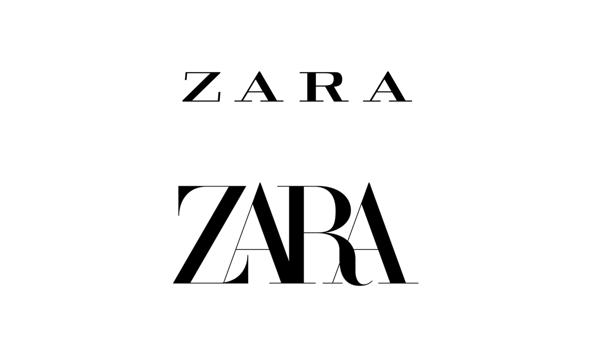
The Spanish clothing retailer unveiled a brand new logo this week but, sadly, not everyone was impressed. For only the second time in their entire 45 years of existence, Zara unexpectedly revealed a redesign of their iconic logo. Instead of bold letters, the updated design consists of curvy, overlapped lettering.
Many were left confused over Zara’s seemingly sudden decision to launch a new look, with one Twitter user asking ‘Why fix something that isn’t broken?’ and another tweeting ‘When you have no money to pay a graphic designer and you use powerpoint #ZARA’. Referring to the brand’s notoriously small clothing sizes, one user joked, ‘The new Zara logo looks like me trying to squeeze into their clothes…’ Ouch.
Redesigning a logo is a huge challenge for any brand and, of course, with big projects comes big risk. If you want to change the way your brand works or looks, it’s important you let your audience know why these changes are happening and how they’re going to benefit their experience. A brand refresh can be a great way of staying ahead of the competition and keeping consumers excited about what you’re doing, but it’s crucial you follow the right steps to make sure things are done right. If you’re considering a change for your brand and need some help, feel free get in touch with us today on 0191 265 2400 or drop us an email on phil@yourprojector.com