Our brand consultancy service is a consultative process, in which we consider what is best for a client’s existing business and brand as we work through the issues in a given brief. Recently, we were asked to look at a rebrand exercise for one of our clients and our opinion was that it would do more harm than good. There are many reasons to consider a rebrand (we’ll blog about this soon) and there are a huge number of reasons to avoid rebranding for it’s own sake. While we looked for examples to back up our argument, we came across a number of failures we thought we’d blog about.
Sometimes, no matter how hard you try, it just doesn’t work. The branding projects included in this list are ones which, for one reason or another, failed to find traction and sooner or later, were overhauled, many back to their original iterations. Some are logos that fell flat, others strategic marketing manoeuvres that did the company more harm than good. Some are just a mess, indications of a business in trouble desperately grabbing at a new logo for help.
There are many honourable mentions who haven’t made it onto the list – Quark’s inadvertent brush with the Scottish Arts Council, Cardiff City or Everton’s logo calamities or Pizza Hut’s brief renaming. None of these, however, feature the unequivocal back-pedalling on show from the following:
• British Airways
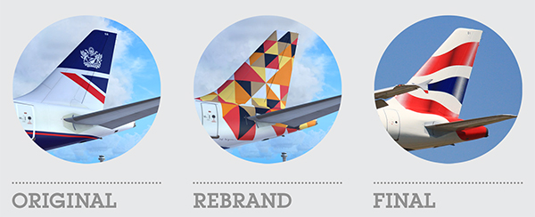
In 1997, as part of an overhaul of the livery of their aircraft, British Airways introduced a new system of artwork for the planes’ tail fins. Referred to at the time as the Utopia tail fins, they featured artwork from international artists and were included on the planes flying international routes. The artwork included Egyptian scrolls, aboriginal art, textile prints and even a piece celebrating the human rights movement. On paper it must have seemed like a great idea – artistic, inclusive and ethnically diverse.
In reality it undermined the public’s attachment to the airline’s British identity. So much so that it prompted former PM Margaret Thatcher to famously cover a tail fin on a model plane with a handkerchief. Within five years all the Utopia tail fins were replaced with a new Union Flag design adapted from those used on the Concorde.
———————————————————
• Coca Cola
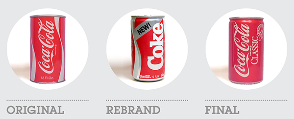
Arguably the biggest branding u-turn in history, The Coca-Cola Company’s introduction of a new product featuring a better-tasting formula to replace their long-standing flagship drink is legendary.
Introduced to the market in 1985, New Coke was the result of extensive market research and user taste testing which convinced the company that their product would be a massive success and help them win the war with Pepsi. And even though initial sales were good and taste tests continued to favour New Coke, growing dissatisfaction that the original drink was no longer available built to an eventual national outcry.
Only 77 days after launching New Coke, the company reintroduced the original drink to the market labelling it Coca-Cola Classic. However, although often referred to as a marketing disaster, the long term effects of this u-turn actually lead to increased sales of the original drink.
———————————————————
• Gap
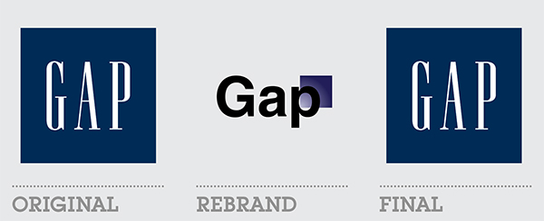
Sometimes, rebrands are only observed by design blogs and commentators, going relatively unnoticed by the average consumer. However, the new logo for Gap (with the exception, perhaps of New Coke) is the most widely known rebranding failure, even by the average person on the street. It became huge news at the time because the company is such a visible and significant retail presence.
It failed for two reasons – it underestimated the equity of its old logo with the public, and it replaced it with a terribly misjudged redesign. The Gap logo was widely known and instantly recognisable. The redesign was middle of the road, generic, forgettable, confusing and, as many people commented, looked like something created in Microsoft Word. In fairness, there’s always some griper who says this about a rebrand, but in this case it happened to be true. Gap reverted to their classic logo just six days later.
———————————————————
• JCPenney
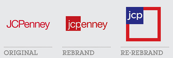
JCPenney is one of the largest department stores in the US and at the beginning of 2011, it decided to update its long standing, bright red, Helvetica word mark. It was the first step in a catastrophic, comedy of errors for the company and its brand.
Chosen from a pool of 200 ideas from marketing companies through to design schools, the first logo change was created by a third year graphic design student. Later that year, a new CEO was brought in and with him came another new logo – one that maintained the dominant square of the previous version but with a new name, jcp, and overwhelming allusions to the American flag.
The following year though, was a sales disaster for the company who floundered with their new marketing strategy. With store closures, massive layoffs and sales down 20%, the new CEO was out and replaced by his predecessor who, comically, changed the logo again. Just over 2 years after the first rebrand, the original, original logo was back.
———————————————————
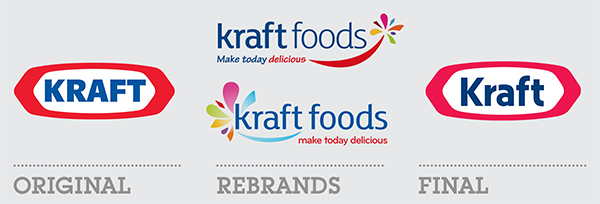
• Kraft Foods
Like the JCPenney debacle, Kraft Food’s rebranding was less a u-turn and more a full-on crash. The rebrand was for the corporate logo, not the consumer one. Even so, it was a mess, its execution clumsy and misjudged. There was a predictable backlash among the design community. So less than 6 months later, they changed it. Or rather they changed it around. The same elements relocated and scaled and, woefully, gradiented. Hardly an improvement or a deterioration, it signalled that Kraft didn’t know what they were doing and were failing with their corporate brand.
Over the next three years they restructured the company and finally, in late 2012, they rebranded again, back to a slightly modified version of the original logo – the red containing device was redrawn and the font changed to a friendly sans serif in title case. They finally achieved a modest improvement to their logo but the road there was a tumultuous and humiliating one.
———————————————————
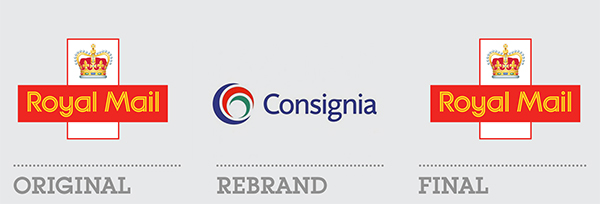
• Royal Mail
In early 2001, the 300-year-old Royal Mail rebranded as Consignia. Although often sited as a pointless rebrand, Royal Mail was actually in a rather confused state beforehand with a muddled public perception about the boundaries between itself and its sister companies, the Post Office and ParcelForce. The company was looking to extend its reach internationally and was looking for a coherent brand that encompassed all three services as well as communicating that it did more than just deliver the mail.
The new name was a crushing failure. Because it was an invented word, its name was widely ridiculed. It further confused the public about its role and was eventually boycotted by the Communications Union. Less than 16 months later it reverted to being called Royal Mail.
———————————————————
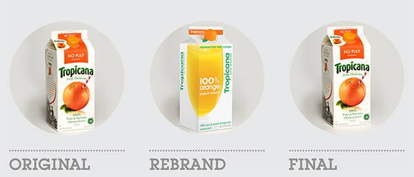
• Tropicana
If the New Coke brouha showed how dangerous it is to underestimate the public’s attachment to a particular product, the Tropicana story gives a similar lesson about a product’s packaging. In late 2008, at the time of their rebranding and packaging redesign, Tropicana were a market leader in their sector. Their packaging was instantly recognisable and, as would become obvious, well-loved by its consumers.
The new juice cartons, while cleaner, slicker and arguably, more pleasant to look at, were too radical a departure from the originals. The company, and the stores who sold the product, were inundated with complaints from customers who couldn’t find their favourite orange juice drink and were demanding to know why it was no longer stocked. Furthermore, those that could locate the cartons found it difficult to differentiate between the different types on offer. It was a complete failure and only four months later, Tropicana reverted to the original carton designs.
———————————————————
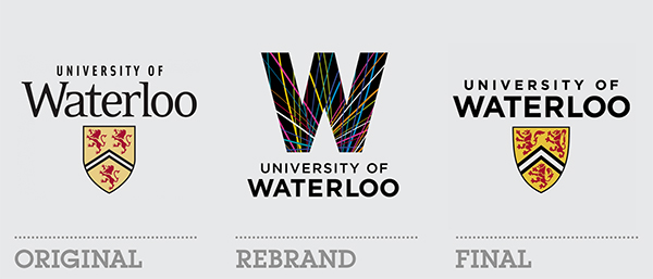
The rebranding of the University of California in late 2012 caused a social media and tabloid storm with a 50,000 strong petition on change.org demanding a reversal to the original logo. However, three years earlier, the University of Waterloo experienced a similar, if somewhat smaller backlash that seems to have set a precedent for students and alumni to criticise and condemn any attempt at rebranding by education establishments.
Like many universities, Waterloo had a traditional crest as its logo and tried something truly radical and unique. Whilst the resulting logo wasn’t amazing, it was certainly memorable and set the university apart – until it finally reverted to an updated version of the shield after buckling under the pressure of criticism.